Hi all,
I'm struggling with the interpretation of the Key Drivers widget.
I went through the documentation, but I'm still lost.
Here is a screenshot of my widget and my raw data (raw data with conditional formatting in Excel). I have dynamical thresholds.
My drivers are 5-point-scale questions (how much do you agree with... from strongly agree = 5 to strongly disagree = 1).
My outcome is a 4-point scale question about stress. I have already recoded this variable in both directions, but the widget stayed EXACTLY the same.
Currently the screenshot shows 1 = much stress (bad) and 4 = little stress (good), to be consistent with the drivers were also high score = good.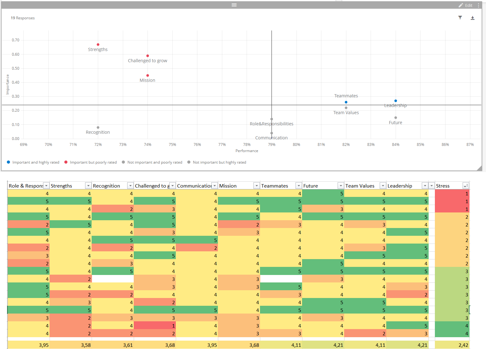
So the X-axis for performance, that one I get: the drivers are ranked according to their average (also in my excel I calculated the averages below and these match with where the point is on the X-axis.
But the Y-axis for Importance is the one I have trouble with.
So I can see that "Strenghts" is the driver the most top-left. So it has a high impact. But we're scoring low on it on average.
When I look at my raw data table, I can see that the people with the best stress score, have the worst strengths score... so there's a correlation, but a negative one? Meaning we wouldn't want to try to get our performance up on that point? Which seems contra-intuitive as an interpretation, which is why I was doubting how to interpret...
Can someone help me get some clarity here :)
Thanks!

Interpretation Key Drivers widget

Userlevel 7
 +26
+26
 +1
+1
Did you ever find out how to interpret it?
I have the same question, a year later... 
Leave a Reply
Enter your username or e-mail address. We'll send you an e-mail with instructions to reset your password.