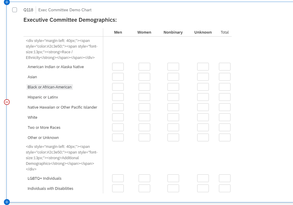
 We want to know the % of each of these to the total. In other words, the % of Asian Men, Asian Women, ect. to the total people.

What would be the best way to report on this question in dashboards?

Userlevel 3
 +7
+7
I would although not a big fan use a pie chart to display this, this would be dependent though on size of a response if its an exec committee the vol might be small and a simple graph shows what you need everyone to see

Userlevel 7
 +56
+56
Also, TJMeersman999, depending on the size of your data set, you could use the Qualtrics web data connector to move the data into Tableau where you could use a tree diagram to show the relationships between the different segments. (I will also put in a feature request for a wider array of visualization types in Vocalize.)
Leave a Reply
Enter your username or e-mail address. We'll send you an e-mail with instructions to reset your password.