Best answer by MichelleC
View originalHow do I make the survey wider so it can accommodate images?
Click Look&Feel and Advanced
Click add custom CSS
Add following:
.Skin .SkinInner {min-width: 1200px!important;}
You can of course adjust the 1200 px to whatever you want.
I'm using classic design but all my matrix questions have messed up labels or show up with scrolls.
> Is there JS code that can make just one page wider? I would like to accomodate a large image, but the rest of the survey can be normal width.
Paste the below code in JS of any of the question of the page, where you want to accommodate the large image
jQuery(".Skin .SkinInner").css({"min-width": "1200px"});
To avoid scaling the width on mobile as well. This seems to work, but I am not sure if this has any other drawbacks. Do anyone else have any experience with this?
Hello everyone,
I've tried adding "
jQuery(".Skin .SkinInner").css({"min-width": "1200px"});
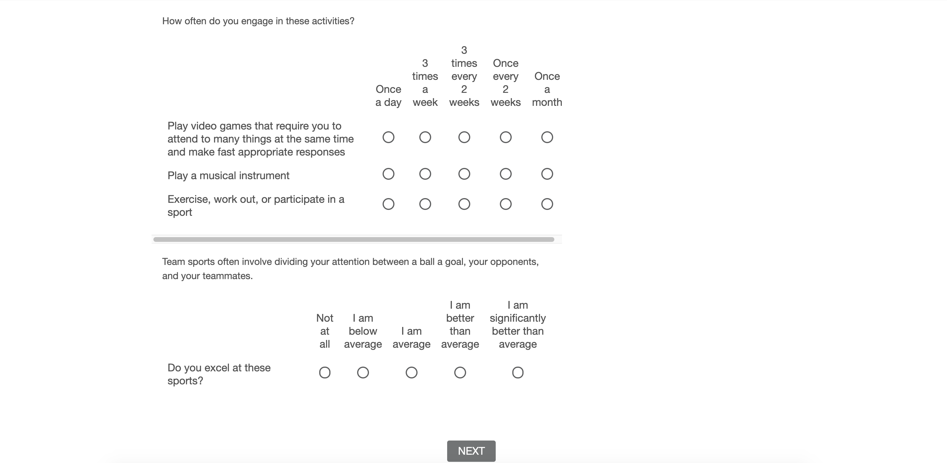
To my JS script for a matrix table but it is still all squished to one side.
In my .CSS code I have specified this min length too. The next button appears centralised and in the middle but all my matrix and questions are over to the left with lots of empty space on the right that I would like to spread the question across. 
Thanks in advance for you time!
 +1
+1
https://community.qualtrics.com/XMcommunity/discussion/comment/714#Comment_714So this worked perfectly for me except that I only want to expand the width for the web version of my survey, not the mobile. Is there any way to achieve this through CSS?
Leave a Reply
Enter your username or e-mail address. We'll send you an e-mail with instructions to reset your password.


