Best answer by NiC
View original
How do I create a line graph that shows NPS score over time (when a survey runs quartlerly)?
 +2
+2
I have fiddled around and can't work out how to make a nice looking visual, where the line continues (all I am getting is dots and no joining lines)

Userlevel 7
 +27
+27
hi @Shelby11
If you are using a date data type , there is an option to group date by quarter as shown in the image below and if the survey is quarterly it should become continuous
!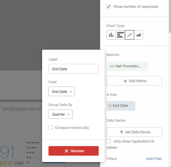
If you are using a date data type , there is an option to group date by quarter as shown in the image below and if the survey is quarterly it should become continuous
!

Userlevel 7
 +33
+33
As @NiC suggested show simple chart lined one across your date record date or end date.
Leave a Reply
Enter your username or e-mail address. We'll send you an e-mail with instructions to reset your password.