Hi all,
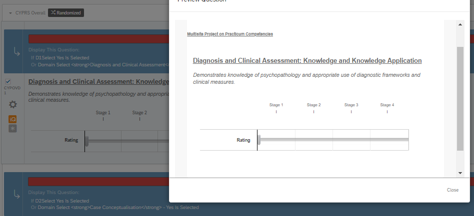
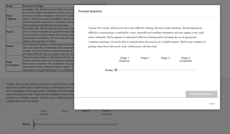
Many years ago my university had someone write some custom html to achieve a particular layout for a slider type question, and it has worked since about 2012. I have been able to make copies of the survey and adjust as necessary in the past, ie., for new batches of data, or major changes to item layout, and the scale with custom html has continued to work. Scale working in the preview window as intended here: Recently however, I have had a need to use a tweaked version of the survey for a different purpose. I copied the survey, adjusted to our needs, and the scales are now being changed to a standard view of a slider, without the delimiting lines we need, and with a different colour scheme and slider indicator. These are essentially useless without the delimiting lines. Scale showing ok in the survey builder, but showing differently in the preview (as it does in the live survey):
 Pulling my hair out as to why??? I'm convinced this has something to do with Qualtrics now placing a 'theme' over any new survey. For the surveys in which this item type works, the theme is completely blank. However, making a copy of the survey now has a different (blank) theme, with no way I can see to completely remove the theme. (I've gone back to the old look and feel menu to try and achieve this, no dice). I've spent half an hour on the phone with Qualtrics rep to try and assist with removing a theme, but as soon as HTML came up, they directed me here.
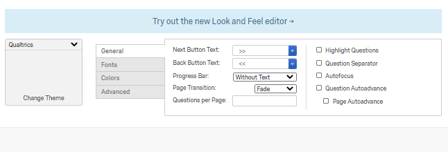
Old survey look and feel settings, seen through 'look and feel' - 'Back to old editor' at bottom of screen: New survey look and feel settings:
Any legends out there think they can suggest possible reasons?
I will note, I am not experienced in any way with html, and apart from being able to generally decipher where the displayed text sits and the font / size info, the rest is gibberish to me. Here is the html that produces the scale in the attached images.
Demonstrates knowledge of psychopathology and appropriate use of diagnostic frameworks and clinical measures.


