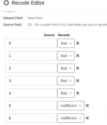
Hi all,
In EX dashboards settings, there is an option called "Scales" that allows you to mark question answers as "favorable", "neutral" and "unfavorable":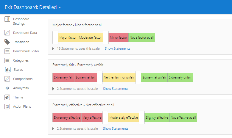 I want to use this in a CX dashboard, but CX dashboards do not have this Scale setting part.
Is there any way to do this in another way in CX?
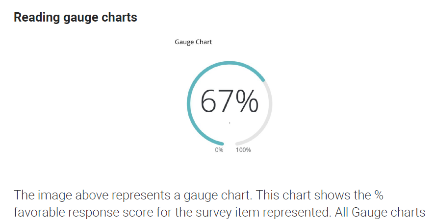
In the end, I want to add a gauge chart that shows the % favorable response score.
e.g. if the question was "the communication with support is going well" with answer options 1: completely disagree to 5: completely agree,
then I'd like the % of respondents who answered favorable, so a 4 or 5.
Thanks for your advice!
Joyca
How to build % favorable response score in CX
Best answer by ElieD
OK, If this is your only need, you'll dont have to recode, finally.
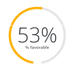
In your report, you can use top/bottom box to show the percentage of one set of responses.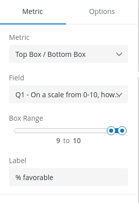 And the result :
Sign up
Already have an account? Login

Welcome! To join the Qualtrics Experience Community, log in with your existing Qualtrics credentials below.
Confirm your username, share a bit about yourself, then you're ready to explore and connect .
Free trial account? No problem. Log in with your trial credentials to join.
No free trial account? No problem! Register here
Already a member? Hi and welcome back! We're glad you're here 🙂
You will see the Qualtrics login page briefly before being taken to the Experience Community.
Login with Qualtrics

Welcome! To join the Qualtrics Experience Community, log in with your existing Qualtrics credentials below.
Confirm your username, share a bit about yourself, then you're ready to explore and connect .
Free trial account? No problem. Log in with your trial credentials to join. No free trial account? No problem! Register here
Already a member? Hi and welcome back! We're glad you're here 🙂
You will see the Qualtrics login page briefly before being taken to the Experience Community.
Login to the Community

Welcome! To join the Qualtrics Experience Community, log in with your existing Qualtrics credentials below.
Confirm your username, share a bit about yourself, then you're ready to explore and connect .
Free trial account? No problem. Log in with your trial credentials to join.
No free trial account? No problem! Register here
Already a member? Hi and welcome back! We're glad you're here 🙂
You will see the Qualtrics login page briefly before being taken to the Experience Community.
Login with Qualtrics

Welcome! To join the Qualtrics Experience Community, log in with your existing Qualtrics credentials below.
Confirm your username, share a bit about yourself, then you're ready to explore and connect .
Free trial account? No problem. Log in with your trial credentials to join. No free trial account? No problem! Register here
Already a member? Hi and welcome back! We're glad you're here 🙂
You will see the Qualtrics login page briefly before being taken to the Experience Community.
Enter your E-mail address. We'll send you an e-mail with instructions to reset your password.


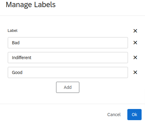
 Edit the labels
 Make association :