 Was making a public report today, but no changes (e.g. chart types, colouring) were reflected in the actual report, had to redo the whole thing.
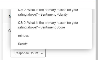
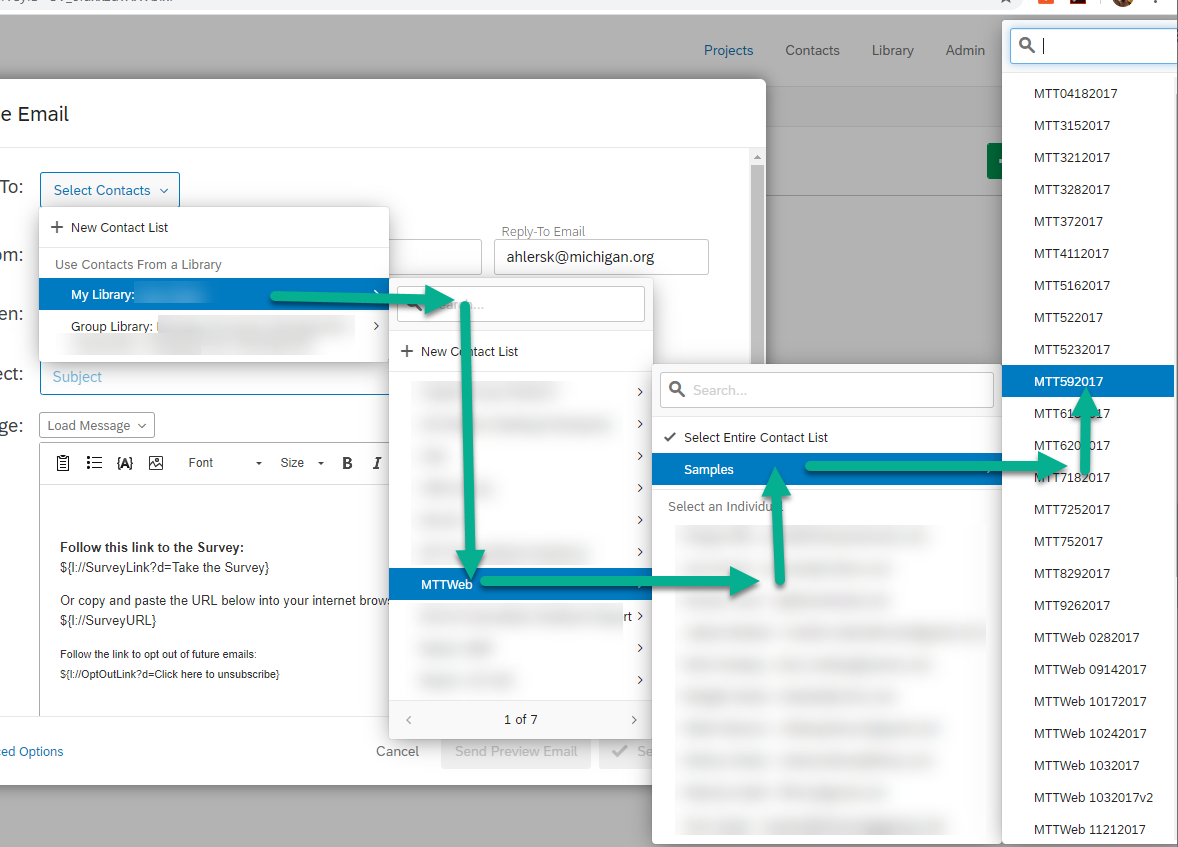
Was not able to access data from my own survey today:
!
 I have submitted a ticket to the support, but wonder if there are any customers having same problem.


 Qualtrics has been buggy in general over the past 6 months or so. I've called support more often in the past 6 months then I have in the 3 years previous. Seemingly lots of updates getting pushed without being really tested through. Last week, I couldn't start a new blank project XD Like- that's the base function of this whole thing!