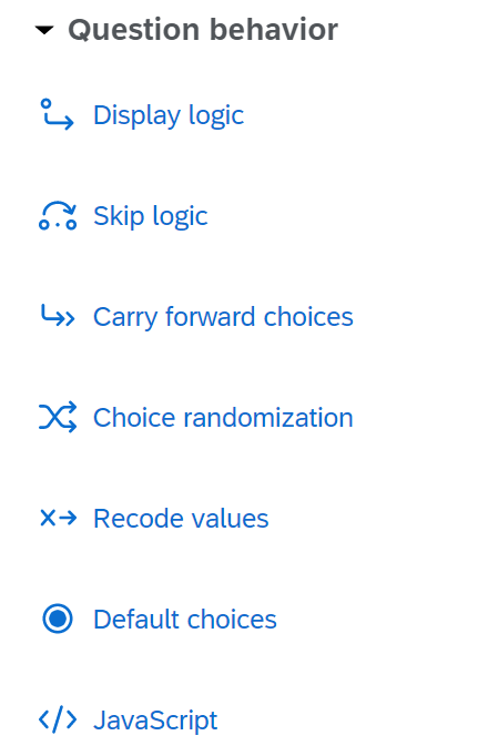
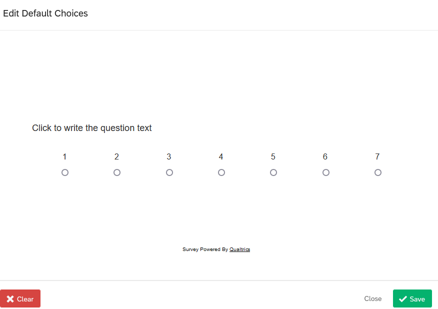
When I look on the new UI for Default Choices, I see a circle with a blue dot in it. It looks like it is already selected (like in a multiple choice/single answer question). Does that throw anyone else off? You click the icon that looks like it's already selected to engage the Default Choices options. I think this is a very confusing icon...am I the only one?
How about the "Import from Library" being only at the bottom of the block? I tend to want to "import" a question - specifically one for a calendar widget. And I'd like to put it in where ever I currently am in the form/survey...but I have to go to the bottom of the block, import it, and then move it where I want it. The new UI was designed to be more user friendly (and for the most part it is), but am I the only one that this annoys?
Am I the only one?
Sign up
Already have an account? Login

Welcome! To join the Qualtrics Experience Community, log in with your existing Qualtrics credentials below.
Confirm your username, share a bit about yourself, then you're ready to explore and connect .
Free trial account? No problem. Log in with your trial credentials to join.
No free trial account? No problem! Register here
Already a member? Hi and welcome back! We're glad you're here 🙂
You will see the Qualtrics login page briefly before being taken to the Experience Community.
Login with Qualtrics

Welcome! To join the Qualtrics Experience Community, log in with your existing Qualtrics credentials below.
Confirm your username, share a bit about yourself, then you're ready to explore and connect .
Free trial account? No problem. Log in with your trial credentials to join. No free trial account? No problem! Register here
Already a member? Hi and welcome back! We're glad you're here 🙂
You will see the Qualtrics login page briefly before being taken to the Experience Community.
Login to the Community

Welcome! To join the Qualtrics Experience Community, log in with your existing Qualtrics credentials below.
Confirm your username, share a bit about yourself, then you're ready to explore and connect .
Free trial account? No problem. Log in with your trial credentials to join.
No free trial account? No problem! Register here
Already a member? Hi and welcome back! We're glad you're here 🙂
You will see the Qualtrics login page briefly before being taken to the Experience Community.
Login with Qualtrics

Welcome! To join the Qualtrics Experience Community, log in with your existing Qualtrics credentials below.
Confirm your username, share a bit about yourself, then you're ready to explore and connect .
Free trial account? No problem. Log in with your trial credentials to join. No free trial account? No problem! Register here
Already a member? Hi and welcome back! We're glad you're here 🙂
You will see the Qualtrics login page briefly before being taken to the Experience Community.
Enter your E-mail address. We'll send you an e-mail with instructions to reset your password.


 To your other issue, I agree as well; it would be helpful to be able to import a question exactly where you want it. The first couple of teams I tried that I thought the feature had gone away until I found the button at the bottom of the block.