Hi All
Hope everyone is well.
My Feedback button site intercept and survey is working well.
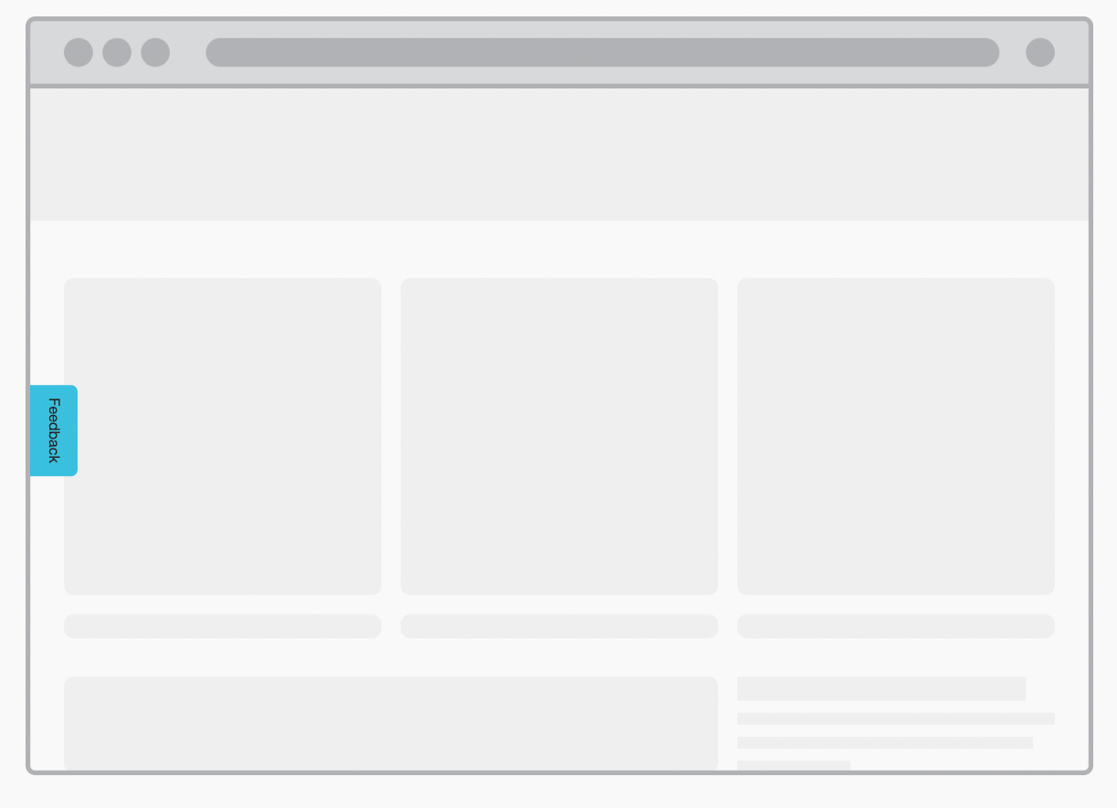
On desktop I am happy with it…

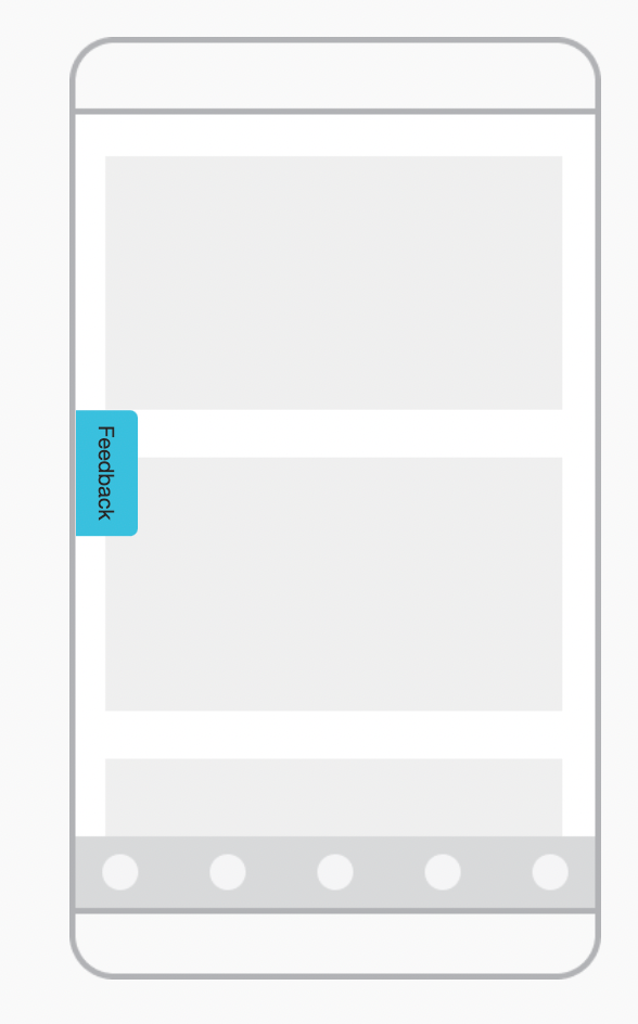
But on Mobile its just a little too prominent / obtrusive…

How can I make the button on mobile better? Possibly smaller or static? I think part of the problem is that it’s floating and can quickly obstruct mobile elements when scrolling.
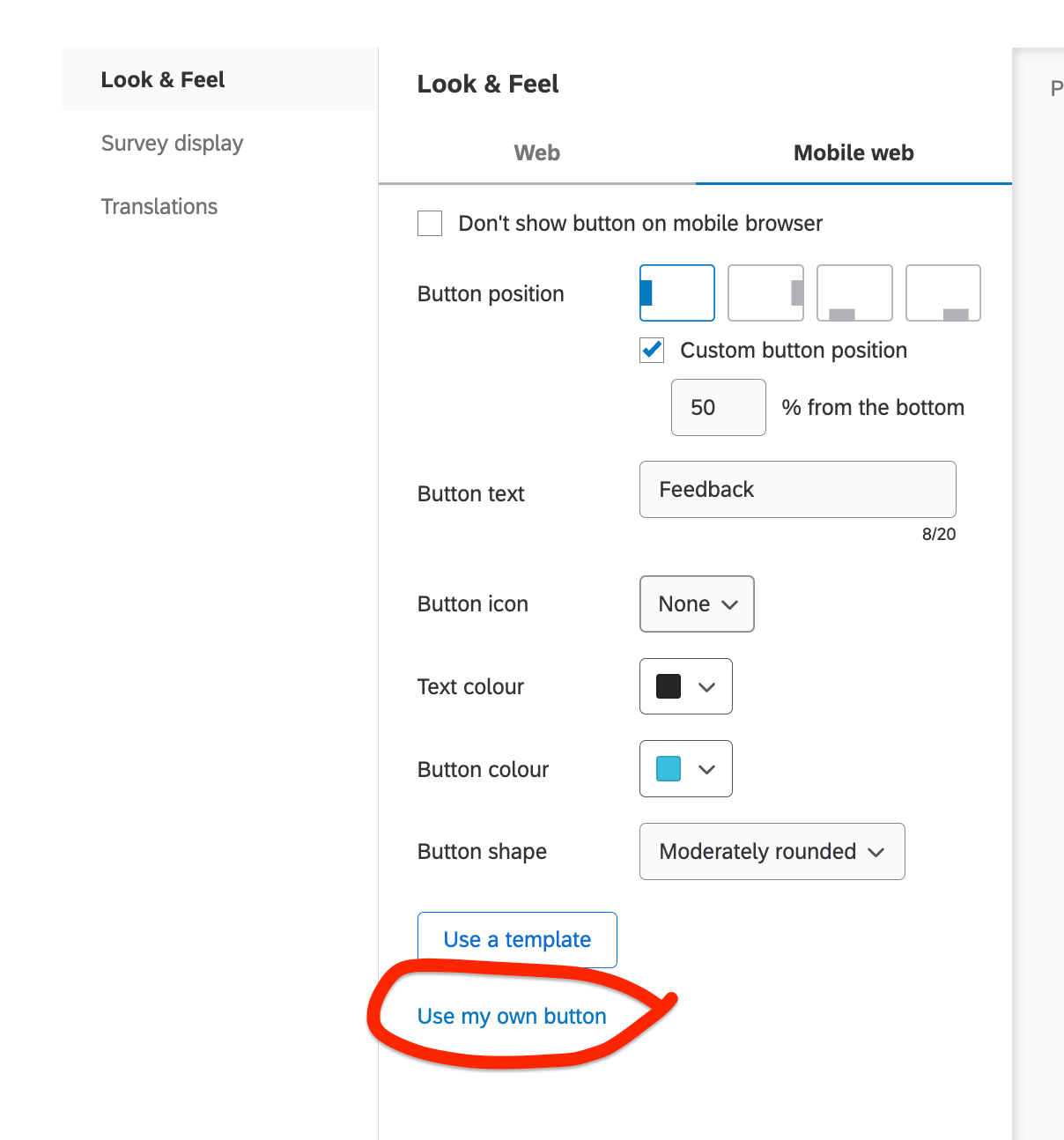
I did try using my own button but when imported the size did not change? Although I am unaware of the guidelines when using your own button. 🤔

As always thanks for the help from the community.
👊


