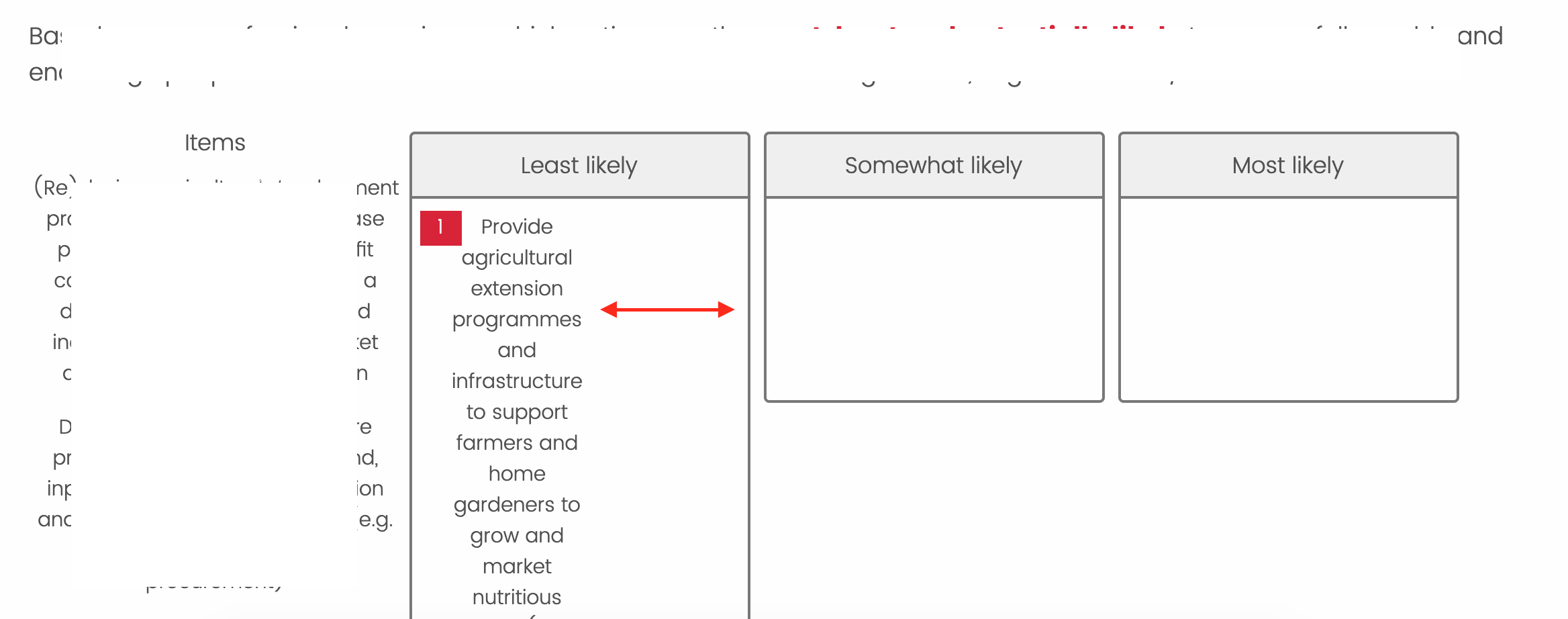
I would greatly appreciate help with some custom CSS in a PIck, Group and Rank question that will change the width of my item text after it has been dragged into the category box so that it matches the width of the box. I have been able to change the width of my survey and my group columns using this code:
.Skin .SkinInner {width: 90%}
.Skin .PGR .DragAndDrop td.groupsContainerTd div h2,.Skin .PGR .DragAndDrop .NoColumns td.groupsContainerTd div ul{width:250px}
.Skin .PGR .DragAndDrop td.groupsContainerTd div>div{width:250px}
.Skin .PGR .DragAndDrop td.itemsContainerTd {width:25%}
.Skin .PGR .DragAndDrop .Group h2, .Skin .PGR .DragAndDrop .Group ul, .Skin .PGR .DragAndDrop .Items h2, .Skin .PGR .DragAndDrop .Items ul {width:100%}
However, now there is empty space within the box.
I found this question asked previously but without an answer here: https://www.qualtrics.com/community/discussion/comment/21184#Comment_21184
Thank you in advance!
Adjusting text width (not column width) within a pick, rank, drop question column
Sign up
Already have an account? Login

Welcome! To join the Qualtrics Experience Community, log in with your existing Qualtrics credentials below.
Confirm your username, share a bit about yourself, then you're ready to explore and connect .
Free trial account? No problem. Log in with your trial credentials to join.
No free trial account? No problem! Register here
Already a member? Hi and welcome back! We're glad you're here 🙂
You will see the Qualtrics login page briefly before being taken to the Experience Community.
Login with Qualtrics

Welcome! To join the Qualtrics Experience Community, log in with your existing Qualtrics credentials below.
Confirm your username, share a bit about yourself, then you're ready to explore and connect .
Free trial account? No problem. Log in with your trial credentials to join. No free trial account? No problem! Register here
Already a member? Hi and welcome back! We're glad you're here 🙂
You will see the Qualtrics login page briefly before being taken to the Experience Community.
Login to the Community

Welcome! To join the Qualtrics Experience Community, log in with your existing Qualtrics credentials below.
Confirm your username, share a bit about yourself, then you're ready to explore and connect .
Free trial account? No problem. Log in with your trial credentials to join.
No free trial account? No problem! Register here
Already a member? Hi and welcome back! We're glad you're here 🙂
You will see the Qualtrics login page briefly before being taken to the Experience Community.
Login with Qualtrics

Welcome! To join the Qualtrics Experience Community, log in with your existing Qualtrics credentials below.
Confirm your username, share a bit about yourself, then you're ready to explore and connect .
Free trial account? No problem. Log in with your trial credentials to join. No free trial account? No problem! Register here
Already a member? Hi and welcome back! We're glad you're here 🙂
You will see the Qualtrics login page briefly before being taken to the Experience Community.
Enter your E-mail address. We'll send you an e-mail with instructions to reset your password.
