 or something like this
!
 I guess that it needs some customizing in CSS (in look and Feel, I think), but I do not know how. I will appreciate any help.
I thank you for your consideration.
 or something like this
!
 I guess that it needs some customizing in CSS (in look and Feel, I think), but I do not know how. I will appreciate any help.
I thank you for your consideration.
I guess that it needs some customizing in CSS (in look and Feel, I think), but I do not know how. I will appreciate any help.
I thank you for your consideration.Best answer by C_Bohn
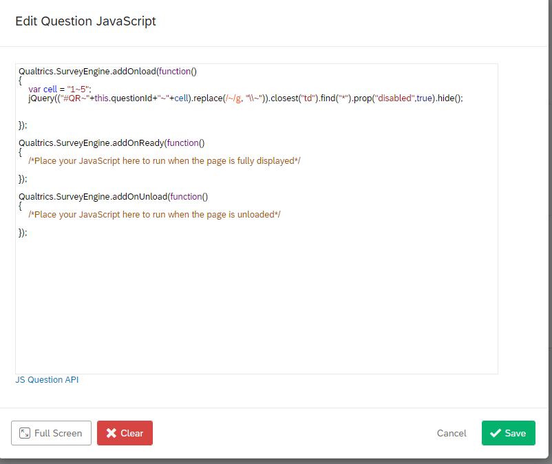
 To hide the middle button, use the following JS in the screen shot shown below.
!
 What you end up with is a question looking something like this:
!
 Note that this code is hiding the button for one statement only. You would need a separate line of code for each statement. The location of the radio button that you want to hide can be easily found with Inspect in your browser.
Already have an account? Login

Welcome! To join the Qualtrics Experience Community, log in with your existing Qualtrics credentials below.
Confirm your username, share a bit about yourself, then you're ready to explore and connect .
Free trial account? No problem. Log in with your trial credentials to join. No free trial account? No problem! Register here
Already a member? Hi and welcome back! We're glad you're here 🙂
You will see the Qualtrics login page briefly before being taken to the Experience Community.
Enter your E-mail address. We'll send you an e-mail with instructions to reset your password.