Display 5-Point Scale Horizontally on Mobile? | XM Community
Skip to main content

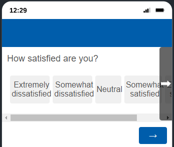
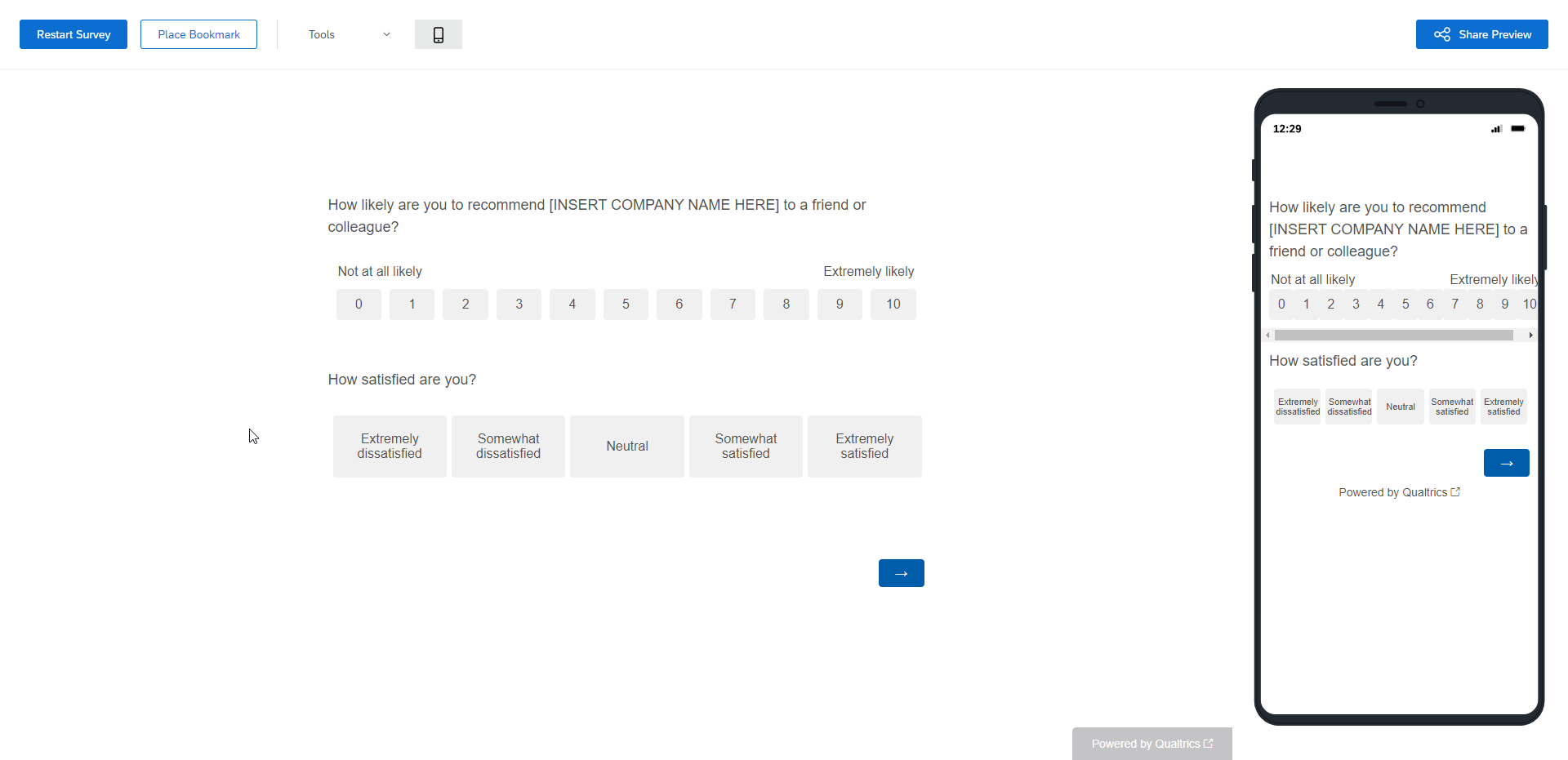
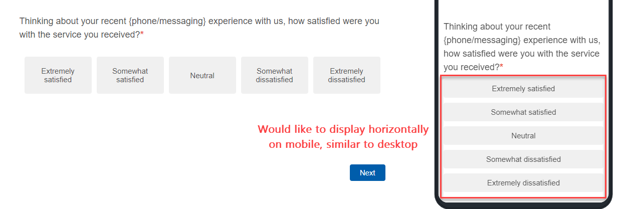
Hi everyone!  I have done quite a bit of searching and haven’t been able to find an answer that accomplishes what I’m hoping to do:  is there a ‘simple’ way to force a 5-point multiple choice answer scale to display horizontally on mobile as it does on desktop?


@JoshB_33 - Set Alignment to Column and number of columns to 5.


@JoshB_33 - Set Alignment to Column and number of columns to 5.

Hi @TomG - thank you for the reply!  I have given that a shot, but on the mobile preview the full 5-point answer scale is not entirely visible (scroll right button present):

Do you happen to know of a way to get around this?


Yes, that’s what I expected would happen. It’s the reason Qualtrics makes them vertical. You can reduce the font size and add ­ between syllables.


Yes, that’s what I expected would happen. It’s the reason Qualtrics makes them vertical. You can reduce the font size and add ­ between syllables.

Good to know I’m at least on the right track!  I did play around with the font sizing of the answer options, which worked just fine for mobile.  However, this adjustment makes the desktop version look a bit small (in my lowly opinion).


Good to know I’m at least on the right track!  I did play around with the font sizing of the answer options, which worked just fine for mobile.  However, this adjustment makes the desktop version look a bit small (in my lowly opinion).

Use a @media css rule to only change the font size on mobile


Good to know I’m at least on the right track!  I did play around with the font sizing of the answer options, which worked just fine for mobile.  However, this adjustment makes the desktop version look a bit small (in my lowly opinion).

Use a @media css rule to only change the font size on mobile

Thank you, @TomG !  I will take a harder look at leveraging a @media css rule.


Sharing for anyone who may find this in the future…


To use a horizontal 5-point scale on mobile and web, I used the following @media CSS rule on the “How satisfied are you?” question that is labeled QID3. This is a Multiple Choice question type in column format with five columns:


@media only screen and (max-width: 600px) {

      #QID3 > div.Inner.BorderColor.SACOL > div > fieldset > div > table > tbody > tr > td > span > label,

      #QID3 > div.Inner.BorderColor.SACOL > div > fieldset > div > table > tbody > tr > td,

      #QID3 > div.Inner.BorderColor.SACOL > div > fieldset > div > table > tbody > tr > td > span

     { font-size:11px; }


Leave a Reply