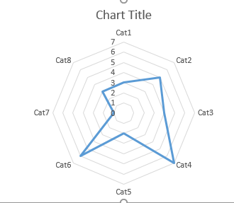
Is it possible to display a graph like the one below based on mean scores of different categories? To clarify: participants need to see this for their own scores, so not in the report section. I already have implemented tailored feedback for all eight categories (descriptive text and display logic with embedded data), but struggle with a graphical display in front of this tailored feedback. I only have the survey module of Qualtrics.
!

Thanks in advance!
Branko
