Hi there!
I'm looking for a way (maybe with custom code...not sure..?) to force my matrix questions to be the mobile-friendly accordion format, even on desktop. This would help prevent straight-lining and also improve consistently since sometimes matrix questions are mobile friendly on mobile devices and sometimes they're not. I tried to make the labels super wide as I saw on another post, but that only worked with the preview showing on my 24" monitor, and I don't want to assume my respondents are necessarily using small monitors or mobile devices. Once I hid the preview, the questions display with a scroll bar, which is not the look I'm going for at all.
Here's what I'd like it to look like: !
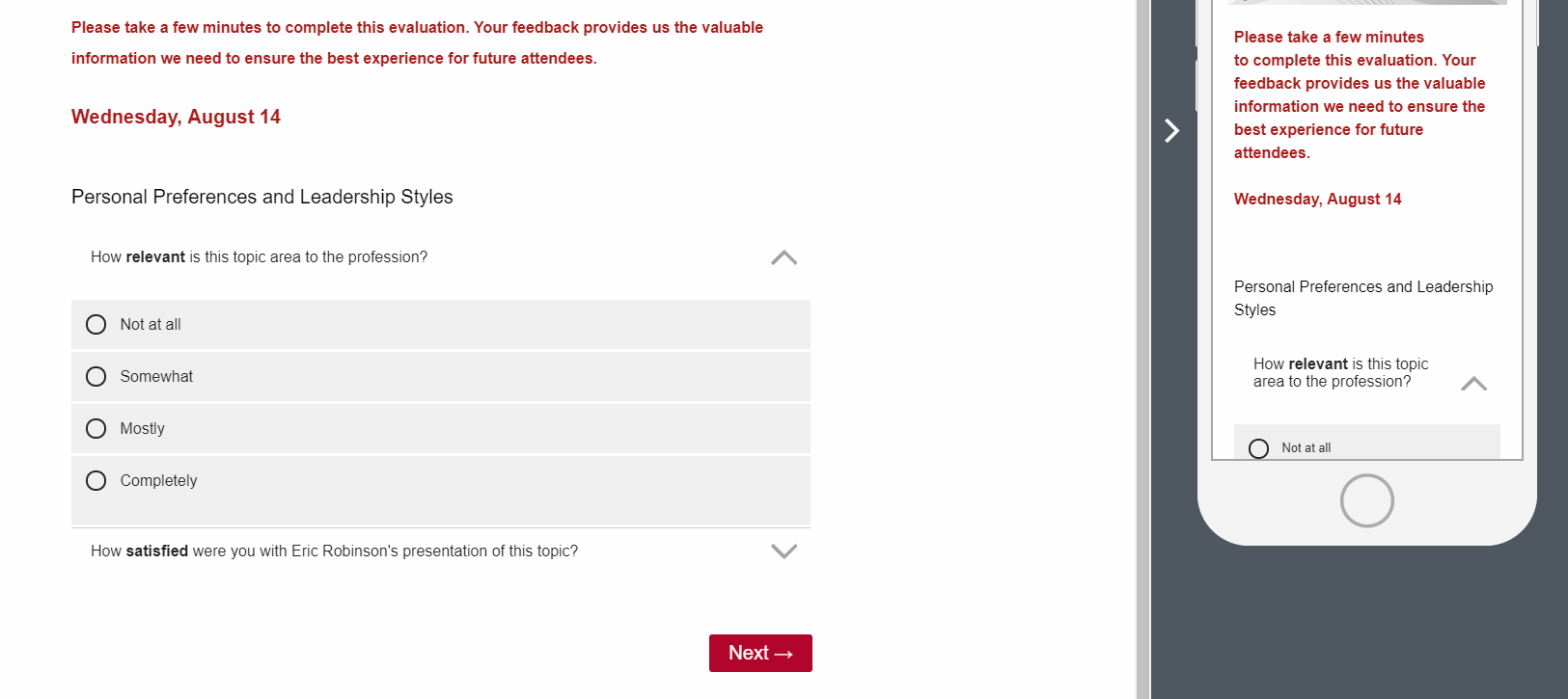
Here's what it's looking like: !
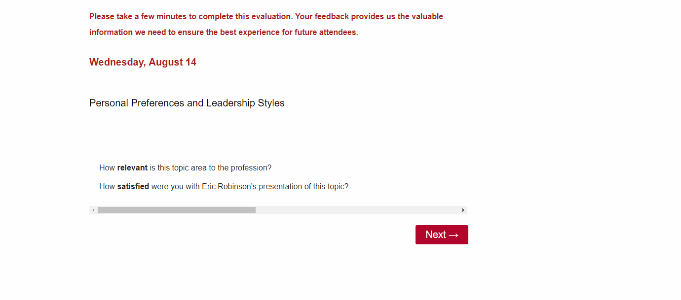
Page 1 / 1
I have the exact same issue and I wonder why others did not encounter it. The matrix question with a slider underneath is not user-friendly at all. I imagine you need some custom css code to force matrix questions being displayed as accordion, but I haven't seen a solution so far.
I am facing the same issue. Any custom code very much appreciated!
Hey guys,
So your matrix table display in a linear fashion even on your desktop (second screenshot)? What do the answers the right of the scrollbar look like? That's bizarre.
Hi! To the right (once you scroll way over there), the labels look just like they would without the scrollbar at all, as if you didn't make the labels super wide. Right?? It's pretty unappealing for sure.
I believe you're getting the scrollbar because you made your statement column super-wide to try and fix the answer options. What problem does that fix? Another way of stating it I guess would be what if you shorten the statement column's width, what's the matrix table look like then?
Right. Making the statement column more narrow definitely eliminates the scroll bar. However, the reason for widening the statement column is that it (allegedly) forces the matrix question to display in a mobile-format--per other threads in the Community.
The goal is to force matrix questions to look like they do on phones/tablets rather than the way they typically look on computer screens.
Leave a Reply
Enter your E-mail address. We'll send you an e-mail with instructions to reset your password.