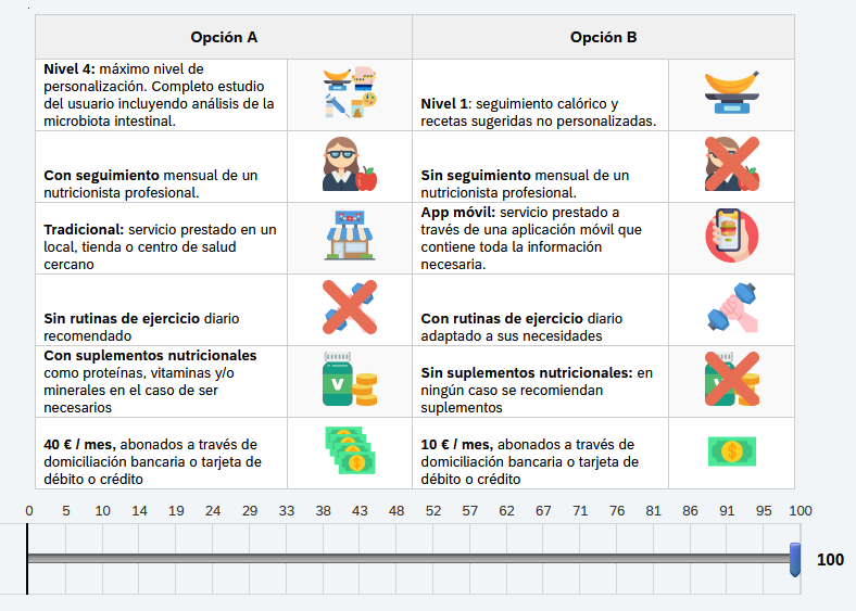
I am designing a survey where respondents have to choose between options A and B. Instead of using a the typical check button, I wanted the respondents to use a slider to know the magnitude of their preferences. See the following example:
!

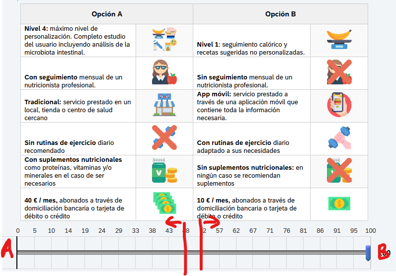
As you can see, the respondent selected 100: this means that he/she would always prefer option B . I have modified the scale for making impossible to select 50. I wonder if it would be possible to have something like the following image (or something similar to improve respondent comprehension).
!

Also, it would be also very nice to modify the scale for the respondent to be able to select all numbers except 50.
Any other ideas/suggestions are very welcome.
Thank you very much.
Daniel.
