Hi,
I have taken the following steps to try and get the first page of my survey to fit into an embedded window, and still coming up short. I'm look for some advice/suggestions.
Here's what I've done so far to make things more compact (so they'll fit):
1) Selected compact in Look and Feel
2) Reduced to 2 questions: first name, last name
3) Added CSS to the logo to reduce space between logo and first line of text which is a text / Graphic field
4) Added CSS to reduce spacing between lines of text
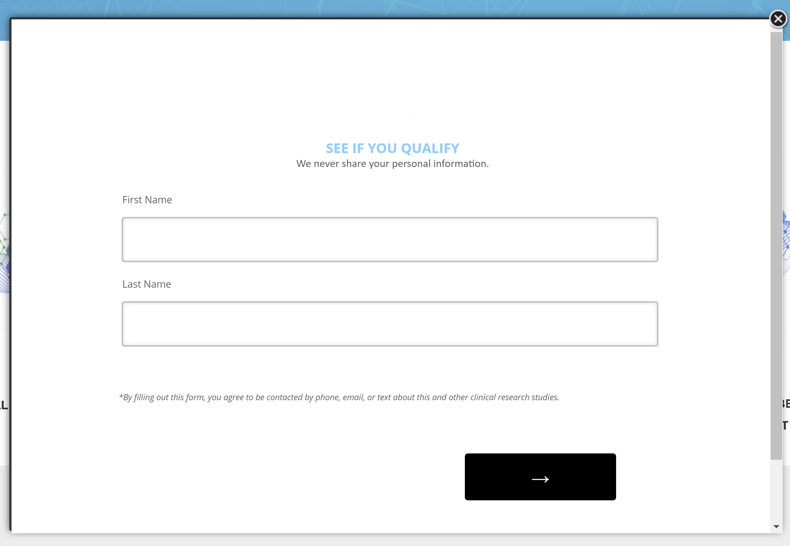
The first page has a logo (removed here), 2 questions, a short disclaimer and a next button, and still requires horizontal scrolling.
Here's what it looks like:
Also, I'm having trouble reducing the size between the following items:
1) The 'last name' (part of a form field) and the disclaimer (text / graphic).
2) The next button and "Powered by Qualtrics" notification at the bottom of the survey page.
I'd be interested in resolving those 2 issues, and possibly reducing the size of the input fields themselves by about 20%. Any other suggestions would be appreciated too.
Thanks!
How can I reduce spacing on everything, make more compact?
Best answer by Tom_1842
Hi there, it looks like you are using the Modern layout. That layout uses the most space of the 3 I think, so switching to Flat or Classic should make things fit a little closer together. Classic will be your best bet.
Alternatively, and you may have seen this thread already, but in the below iammike provides some CSS that tackles reducing white space across the survey. I should note though, it removes displaying the 'Powered by Qualtrics' bit, which I don't really recommend.
https://community.qualtrics.com/XMcommunity/discussion/4214/how-to-reduce-space-between-buttons-and-footer
For some CSS that keeps the plug visible and with a reduction in space, I found the below thread with some neat CSS provided by Eric_Vance_Martin, but I couldn't get it to work nicely with the footer text when playing around with the screen size, much like the problem Eric posted about. Still, between these 2 CSS threads, hopefully it can get you going in the right direction.
https://community.qualtrics.com/XMcommunity/discussion/9977/how-to-control-stickiness-spacing-and-width-of-footer-elements-custom-css
Sign up
Already have an account? Login

Welcome! To join the Qualtrics Experience Community, log in with your existing Qualtrics credentials below.
Confirm your username, share a bit about yourself, then you're ready to explore and connect .
Free trial account? No problem. Log in with your trial credentials to join.
No free trial account? No problem! Register here
Already a member? Hi and welcome back! We're glad you're here 🙂
You will see the Qualtrics login page briefly before being taken to the Experience Community.
Login with Qualtrics

Welcome! To join the Qualtrics Experience Community, log in with your existing Qualtrics credentials below.
Confirm your username, share a bit about yourself, then you're ready to explore and connect .
Free trial account? No problem. Log in with your trial credentials to join. No free trial account? No problem! Register here
Already a member? Hi and welcome back! We're glad you're here 🙂
You will see the Qualtrics login page briefly before being taken to the Experience Community.
Login to the Community

Welcome! To join the Qualtrics Experience Community, log in with your existing Qualtrics credentials below.
Confirm your username, share a bit about yourself, then you're ready to explore and connect .
Free trial account? No problem. Log in with your trial credentials to join.
No free trial account? No problem! Register here
Already a member? Hi and welcome back! We're glad you're here 🙂
You will see the Qualtrics login page briefly before being taken to the Experience Community.
Login with Qualtrics

Welcome! To join the Qualtrics Experience Community, log in with your existing Qualtrics credentials below.
Confirm your username, share a bit about yourself, then you're ready to explore and connect .
Free trial account? No problem. Log in with your trial credentials to join. No free trial account? No problem! Register here
Already a member? Hi and welcome back! We're glad you're here 🙂
You will see the Qualtrics login page briefly before being taken to the Experience Community.
Enter your E-mail address. We'll send you an e-mail with instructions to reset your password.


