Sometimes, when you are testing for an advertisement or other large sized flat image, you will want to have the image show up on a full screen so that the participant can get a fair chance at viewing the full stimulus before asking them to rate the concept. But, if you are to update this in the header of your custom CSS under Look & Feel, it will alter the look of your multiple choice or other question types, which is also undesirable.
You actually do not have to alter the Look & Feel or use header CSS in Qualtrics to change the size for a single image.
Instead do the following steps:
1. Open up the question that you want and click on the HTML view tab.
2. Above the text, enter the following code:
<strong>Please click on the areas of this screen that you like the best. </strong>
<style type="text/css">.Skin .SkinInner {
max-width: 100%;
margin: auto
}
</style>
That's it! Setting the max-width to 100% just allows for it to be responsive to any screen size.
Happy testing!

Page 1 / 1
Correction, because the code got messed up in my initial post.
The CSS code is written as below:
<style>
.Skin .SkinInner {
width: 100%;
max-width: 1600px;
margin: auto
}
</style>
The CSS code is written as below:
<style>
.Skin .SkinInner {
width: 100%;
max-width: 1600px;
margin: auto
}
</style>
")
@NiC_Ugam you are welcome. Please let me know if you find this useful.
Hi @manresaclara,
I can't get this to work, I've inserted a Rich Text field, added an image from the library, then gone into the HTML code and added the line putting <style> and </style> either side. This is the resulting code:
<"style> .Skin .SkinInner { max-width: 100%; margin: auto } <"/style>
<"img src="https://warnerhotels.eu.qualtrics.com/CP/Graphic.php?IM=IM_6mRrDoT4qC5XpGd" style="width: 1101px; height: 825px;" />
(Please ignore the " preceding 'img' and '/style' as this is to stop the code being parsed. I thought there was a way to insert code as text into these comment boxes but perhaps not?!)
Please can someone advise as I am new to writing HTML and CSS?
Thanks
Rod Pestell
@Rod_Pestell
The max-width property is to define what is the maximum that the window should be allowed, and so if you set it to 100%, it is basically doing the same as it was before.
Please try this code and see if it works for you.
.Skin .SkinInner { width: 100%; max-width: 1600px; margin: auto }
The max-width property is to define what is the maximum that the window should be allowed, and so if you set it to 100%, it is basically doing the same as it was before.
Please try this code and see if it works for you.
.Skin .SkinInner { width: 100%; max-width: 1600px; margin: auto }
@manresaclara , thanks for the reply. I've also been struggling with the syntax and have learnt a few things today which may help. I should be writing the syntax like:
<style type="text/css"> img { width: 100%; max-width: 600px; margin: auto } </style>
<img src="https://warnerhotels.eu.qualtrics.com/ControlPanel/Graphic.php?IM=IM_1N3EbDQtdfCCvpX" />
Changing the max-width value seems to vary the size of the image but anything greater than 600px makes no difference. FYI the image I am using is 825 x 1101. So it looks like it's being restricted by the theme or some other style?
I then tried swapping out img with .skin .skininner but it's not working as the image wouldn't change size even if you drop max-width to 300px.
<style type="text/css"> .skin .skininner { width: 100%; max-width: 1600px; margin: auto } </style>
<img src="https://warnerhotels.eu.qualtrics.com/ControlPanel/Graphic.php?IM=IM_1N3EbDQtdfCCvpX" />
I don't think the syntax is right of the above code, can you advice? I'm hoping that using the .skin .skininner route will make the image bigger than 600px?
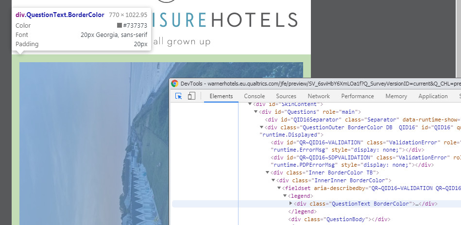
I also inspected the page and could see that the image is being restricted by the QuestionText Border. So I would like the image to simply overlay and cover up anything that maybe there, even the top title (See below image)
Thanks
Rod Pestell
!
<style type="text/css"> img { width: 100%; max-width: 600px; margin: auto } </style>
<img src="https://warnerhotels.eu.qualtrics.com/ControlPanel/Graphic.php?IM=IM_1N3EbDQtdfCCvpX" />
Changing the max-width value seems to vary the size of the image but anything greater than 600px makes no difference. FYI the image I am using is 825 x 1101. So it looks like it's being restricted by the theme or some other style?
I then tried swapping out img with .skin .skininner but it's not working as the image wouldn't change size even if you drop max-width to 300px.
<style type="text/css"> .skin .skininner { width: 100%; max-width: 1600px; margin: auto } </style>
<img src="https://warnerhotels.eu.qualtrics.com/ControlPanel/Graphic.php?IM=IM_1N3EbDQtdfCCvpX" />
I don't think the syntax is right of the above code, can you advice? I'm hoping that using the .skin .skininner route will make the image bigger than 600px?
I also inspected the page and could see that the image is being restricted by the QuestionText Border. So I would like the image to simply overlay and cover up anything that maybe there, even the top title (See below image)
Thanks
Rod Pestell
!
Leave a Reply
Enter your E-mail address. We'll send you an e-mail with instructions to reset your password.