Hi everyone,
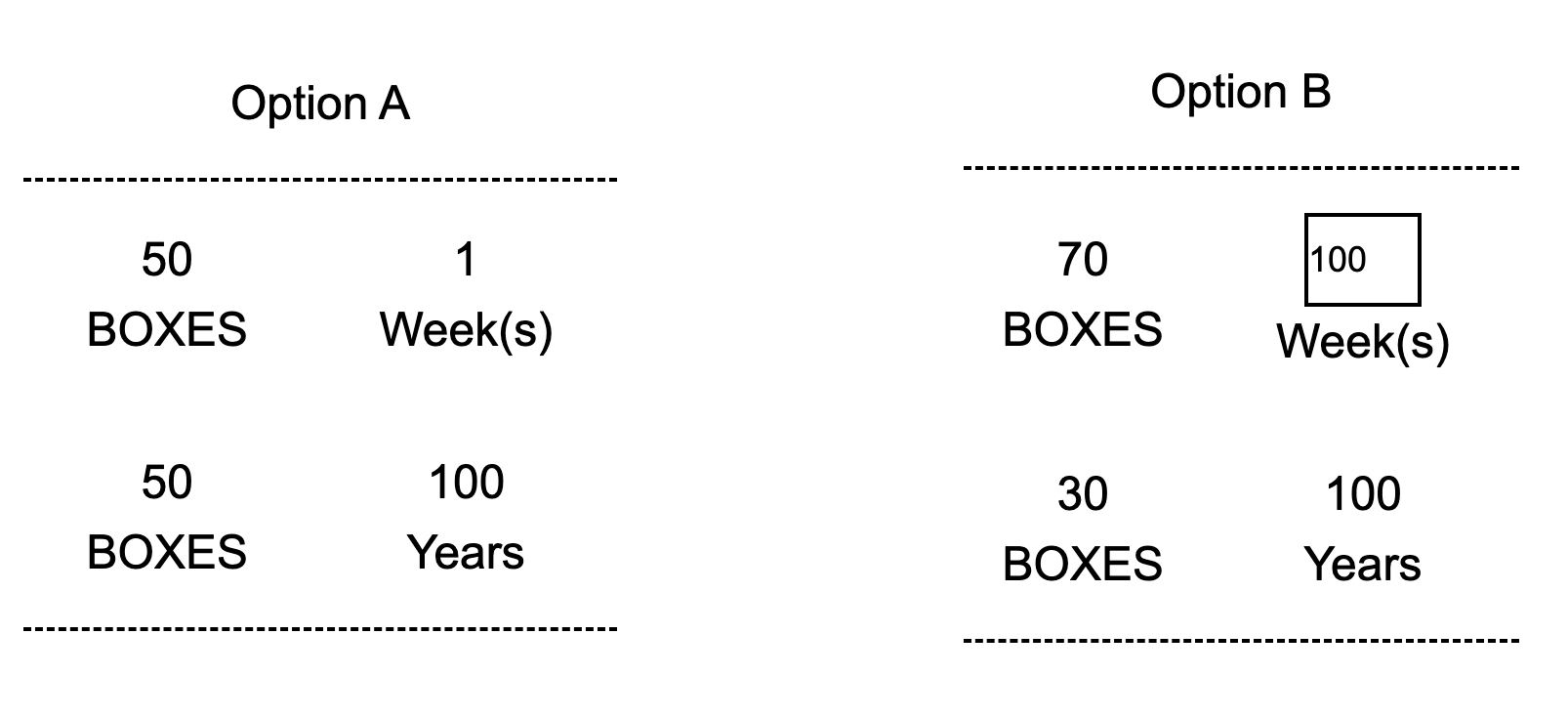
I notice that for the inputbox of the text entry question, there exist extra vertical spaces beyond padding as you can see below figure. Also, you can see the demo page here.
The eventual goal is to make two options same regarding the height and width, but due to the vertical space in the text entry box of the right option, current situation is suboptimal. I tried to adjust the margin and padding of the inputbox, but extra vertical spaces still exist while the left/right padding can be reduced by adjusting the padding.
Qualtrics.SurveyEngine.addOnReady(function () {
	const inputBox = document.querySelector(".InputText");
	const inputHolder = document.querySelector(".input-holder");
	inputHolder.insertAdjacentElement("afterbegin", inputBox);
	inputBox.type = "number";
	inputBox.style.width = "6rem";
	inputBox.style.maxWidth = "50%";
	inputBox.style.background = "transparent";
	inputBox.style.color = "black";
	inputBox.style.margin = "0px 0px";
	inputBox.style.borderColor = "gray";
	inputBox.style.padding = "0px 5px";
});
Any help will be very appreciated. Thanks for your attention and help very much.
Regards,


