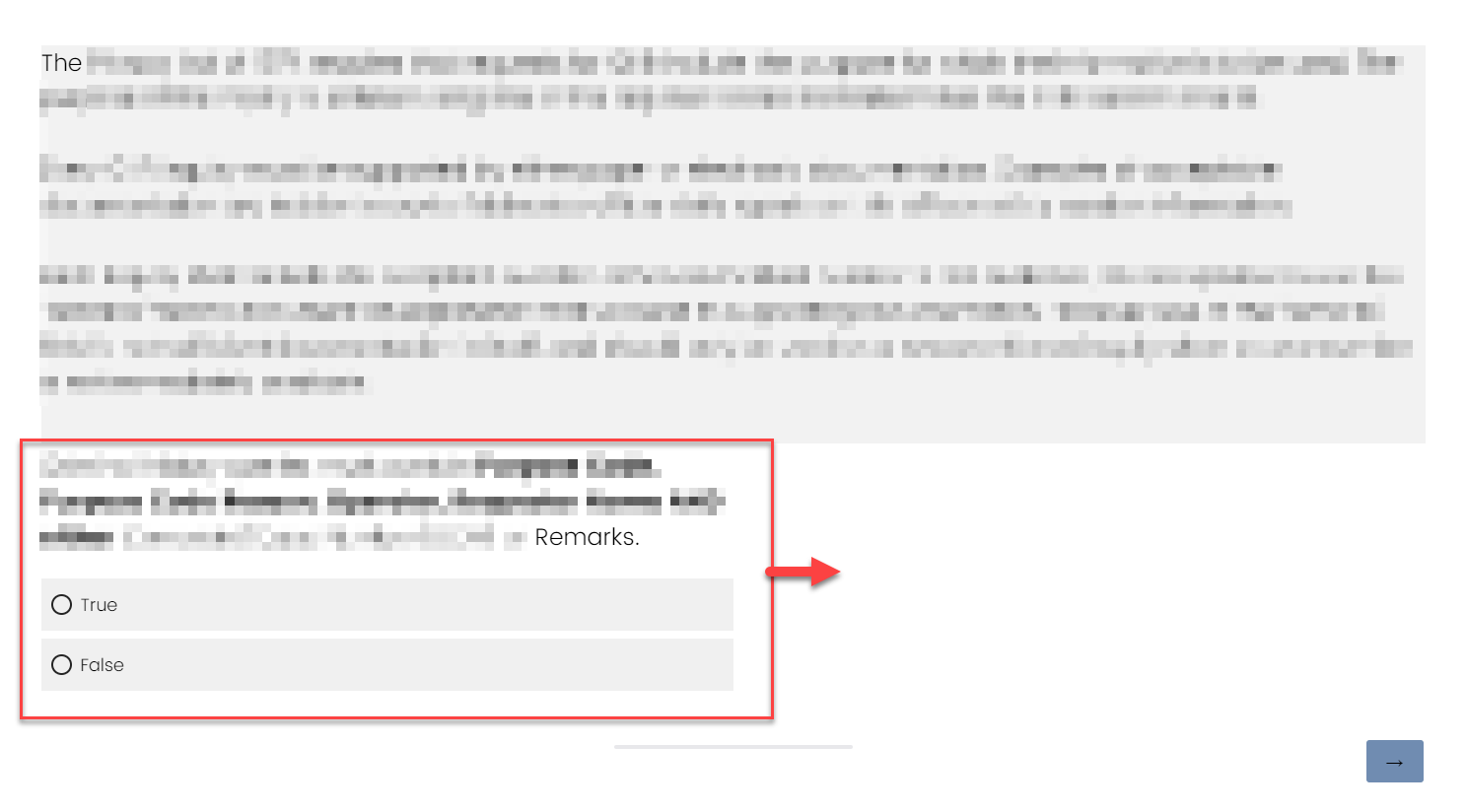
I am making a test and I want the Text/Graphic "question" to be larger on the screen and separated from the multiple choice question below it. I wanted to do this by having general text span the whole screen and then format the actual multiple choice question smaller and centered on the screen. I was able to do most of it with the below CSS in the survey look and feel.
#SkinContent{ width:75vw; }
.Skin .QuestionOuter{max-width: 100%;}
.Skin .QuestionOuter.MC{max-width: 50%}
However, I cannot figure out how to have the smaller multiple choice section now centered on the screen, it is left aligned with everything I do. I do not want the text itself center-aligned, I just want the box of text and questions to show in the middle of the screen. Everything I have seen deals with margins but those are adjusted from my code above.
I tried the below but it doesn't do anything...
.Skin .QuestionBody{display: flex; justify-content: center}
I have a very novice level of understanding in either Java or CSS so I am not sure what I am missing. Thanks.
How to center align Multiple Choice Questions in entire survey.
Sign up
Already have an account? Login

Welcome! To join the Qualtrics Experience Community, log in with your existing Qualtrics credentials below.
Confirm your username, share a bit about yourself, Once your account has been approved by our admins then you're ready to explore and connect .
Free trial account? No problem. Log in with your trial credentials to join.
No free trial account? No problem! Register here
Already a member? Hi and welcome back! We're glad you're here 🙂
You will see the Qualtrics login page briefly before being taken to the Experience Community
Login with Qualtrics

Welcome! To join the Qualtrics Experience Community, log in with your existing Qualtrics credentials below.
Confirm your username, share a bit about yourself, Once your account has been approved by our admins then you're ready to explore and connect .
Free trial account? No problem. Log in with your trial credentials to join. No free trial account? No problem! Register here
Already a member? Hi and welcome back! We're glad you're here 🙂
You will see the Qualtrics login page briefly before being taken to the Experience Community
Login to the Community

Welcome! To join the Qualtrics Experience Community, log in with your existing Qualtrics credentials below.
Confirm your username, share a bit about yourself, Once your account has been approved by our admins then you're ready to explore and connect .
Free trial account? No problem. Log in with your trial credentials to join.
No free trial account? No problem! Register here
Already a member? Hi and welcome back! We're glad you're here 🙂
You will see the Qualtrics login page briefly before being taken to the Experience Community
Login with Qualtrics

Welcome! To join the Qualtrics Experience Community, log in with your existing Qualtrics credentials below.
Confirm your username, share a bit about yourself, Once your account has been approved by our admins then you're ready to explore and connect .
Free trial account? No problem. Log in with your trial credentials to join. No free trial account? No problem! Register here
Already a member? Hi and welcome back! We're glad you're here 🙂
You will see the Qualtrics login page briefly before being taken to the Experience Community
Enter your E-mail address. We'll send you an e-mail with instructions to reset your password.


 Here is how mine looks currently and I want the entire Multiple Choice question in the red box to show up centered instead of on the left side of the screen.
