How to change color of Request Response dialog box
My survey uses dark blue as the background with a white question container.
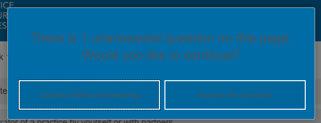
Some of my questions have Response Requirements - REQUEST RESPONSE turned on.
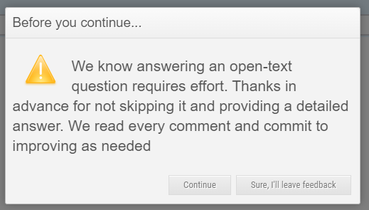
If a respondent tries to skip the question, the request response dialog box appears in dark blue with black text which makes it practically unreadable.
How can I change either the text color or the background color of this box? I tried contacting Qualtrics support but they said I needed to use custom code and referred me to this platform. I am hoping I can do it with CSS but I don’t know what I would enter.
Page 1 / 1
Try adding the below CSS to the Style section of the survey’s Look & Feel:
Awesome! That worked perfectly! I could not have fixed this without your help (I tried everything). Thank you so much
Hi @Tom_1842
Thank you so much for this answer. It was super helpful for me as well.
I was wondering if there’s a way to get rid of the warning triangle icon in the message?
In general I’m looking to either replace it with something more friendly or remove it at all. Maybe change it to listening icon like the one here
THANKS!!
@deveer One way to change the symbol that displays next to the Request Response message for Classic layout is to add the below CSS to the Style section of the Look & Feel, updating the URL as needed:
The CSS code didn’t work for me. Do I need to change something?
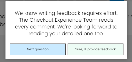
Thank you @Tom_1842 for your kind response… I’m actually going to leave here the CSS code that I’m using now so if it helps someone I’m happy:
By Copy Pasting this code to the Java Script of a question you’ll get the option of request a response dialog that is customized and with translations (taking into consideration surveys with more than one language).
Qualtrics.SurveyEngine.addOnload(function() { /*Place your JavaScript here to run when the page loads*/
});
Qualtrics.SurveyEngine.addOnReady(function() { /*Place your JavaScript here to run when the page is fully displayed*/ jQuery("#NextButton").click(function() {
if("${e://Field/Q_Language}" == "VI") {
setTimeout(function() { jQuery("#ErrorMessage > span").html("Chúng tôi hiểu rằng bạn đã dành công sức để chia sẻ ý kiến! Vậy nên, Đội ngũ Trải Nghiệm Checkout của chúng tôi sẽ đọc ý kiến một cách cẩn thận. Chúng tôi rất mong đợi đọc ý kiến chi tiết từ bạn."); jQuery("#Page > div > div.PageErrorDialog > div.ErrorButtons > button:nth-child(1)").html("Câu hỏi tiếp theo"); jQuery("#Page > div > div.PageErrorDialog > div.ErrorButtons > button:nth-child(2)").html("Tôi sẽ để lại ý kiến của mình"); }, 5);
};
if("${e://Field/Q_Language}" == "EN" ) {
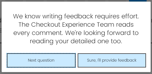
setTimeout(function() { jQuery("#ErrorMessage > span").html("We know writing feedback requires effort. The Checkout Experience Team reads every comment. We’re looking forward to reading your detailed one too."); jQuery("#Page > div > div.PageErrorDialog > div.ErrorButtons > button:nth-child(1)").html("Next question"); jQuery("#Page > div > div.PageErrorDialog > div.ErrorButtons > button:nth-child(2)").html("Sure, I'll provide feedback"); }, 5);
Qualtrics.SurveyEngine.addOnUnload(function() { /*Place your JavaScript here to run when the page is unloaded*/
});
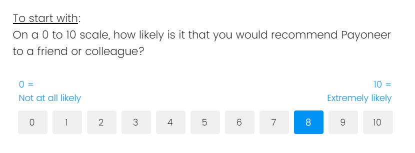
Also, I’m putting here the colors CSS + as bonus changing the look and feel of an NPS questions so the buttons are square and not small rounds.+ Changing the icon and color of force response and validation error.
.Skin .ValidationError::before { content: "\00a0"; /* Adding one non-breaking space for minimal space */ display: inline-block; }
.Skin .ValidationError { background: url(https://payoneer.eu.qualtrics.com/ControlPanel/Graphic.php?IM=IM_SvLMHSzh2ze23Hy) no-repeat left top !important; font-size: 16px; /* Adjust the font size as needed */ }