Hi there!
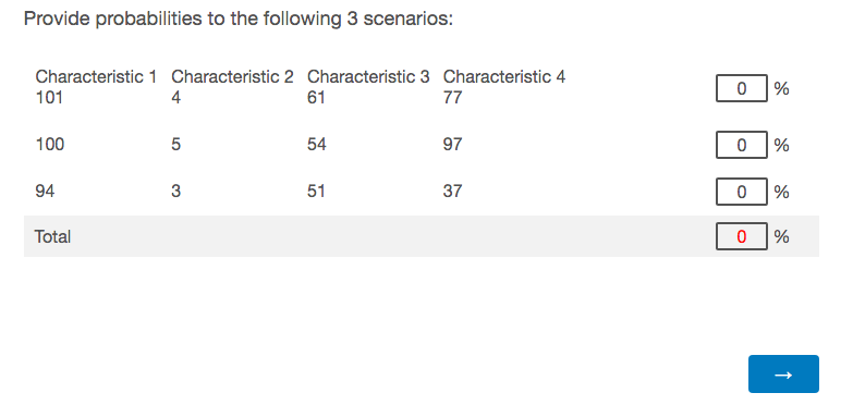
I am using a constant sum question to ask for marginal probabilities on three different events, each defined by 4 characteristics. In order to make it easier for the respondent to spot the differences across the events I am using a table within each answer to input the value for each characteristic.
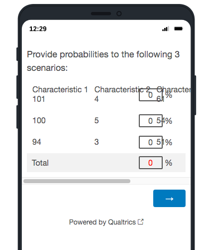
The desktop version of the question is displayed without a problem, as can be see in the first screenshot below. In the mobile version however, the boxes are displayed on top of the answer text (please, see the second screenshot). Although this is not an issue anymore when the mobile device is rotated into landscape, I would like to also find a solution for the vertical view in mobile.
Hence my question is: Would anyone know how to add custom code to the table -- using the @media query I guess -- to resize the table so the answer boxes are displayed further to the right in the mobile screen?
 Please, see the html code for the table containing the first event:
| Characteristic 1 | Characteristic 2 | Characteristic 3 | Characteristic 4 |
| 101 | 4 | 61 | 77 |


