Increase distance between form field question and entry box
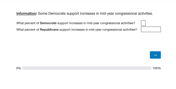
My survey has a number of questions that look like this:
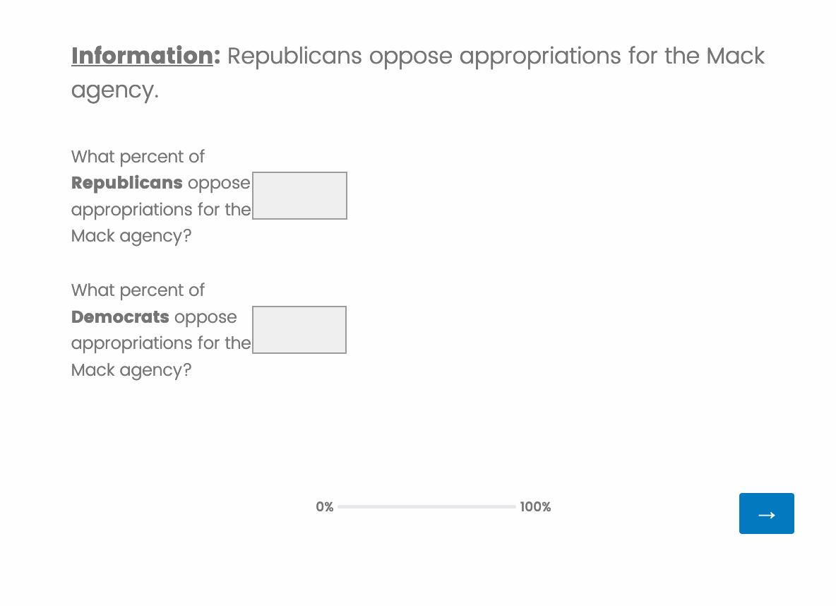
The question and the entry box are very cramped together and overlap with one another. Is there anyway to increase the space between the two? I would also like to increase the width allotted to the question so that it isn’t spread out across so many rows of text. Thanks
Page 1 / 1
Hi @gusnovoa ,
Kindly add below code in the HTML view of your question and adjust the value of width accordingly.
Also, in the builder screen only, you can adjust the width of the textbox. Try to manage both values for a good look and feel.
Hope this helps:)
Regards,
PD
Hi Prateek,
Thanks for your answer. The HTML code you offered did allow me to expand my question over 1-2 rows as desired. However, it has also made my text entry box sizes inconsistent.
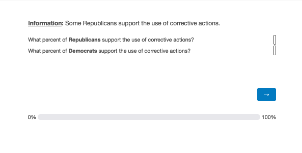
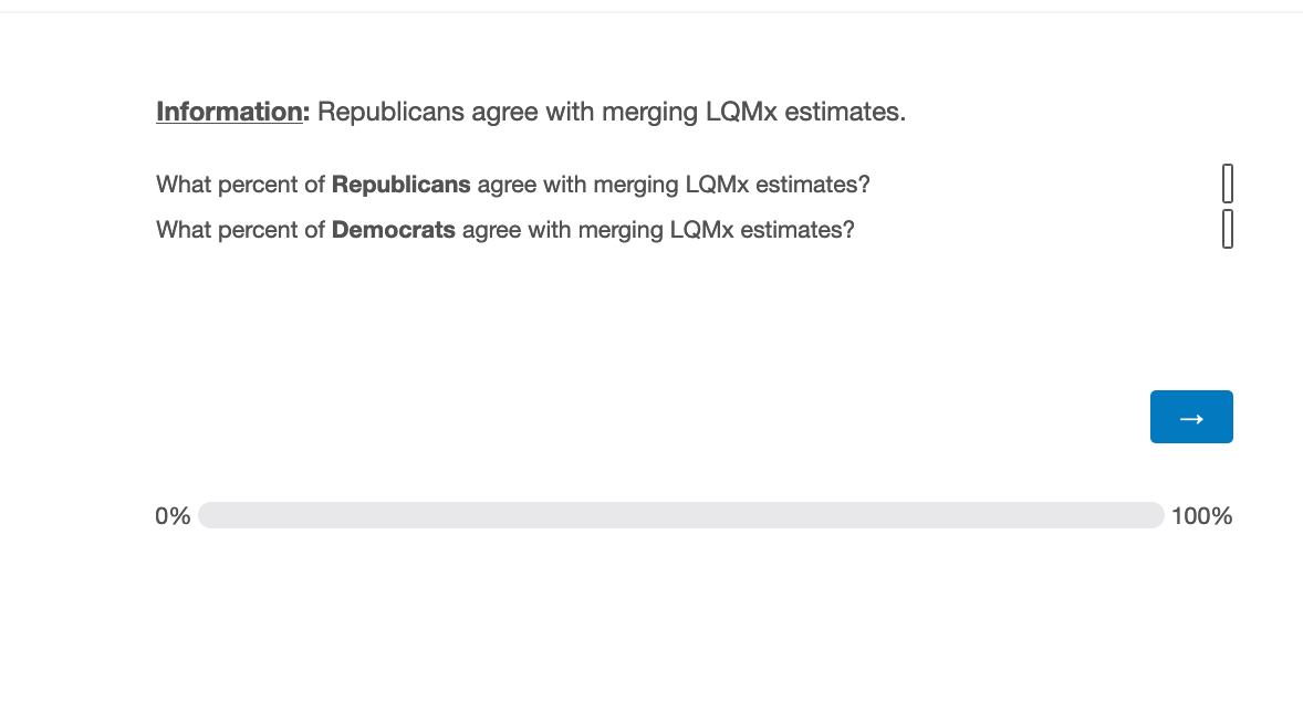
All my questions in this block have the same HTML code (the one you provided), however some have different text box sizes within the question and others have the same within the question, but different across questions. For example:
This is happening despite me setting every text box to 100pixels in width.
I can see now that if I click a specific question then go to validation and then back to the question, that the text entry boxes are reverting back to smaller sizes.
That’s why you need to do hit and try with width value (try reducing few %ages) and textbox size. For me, I generally open the developer tools (ctrl+shift+i) of the browser and work on it till I get the desired result.
ctrl+shift+i - to open the developer tools.
ctrl+shift+c - Select the column on which you need to work.
On the other partition under “style”, do hit and try with width or other attributes.
Thanks,
PD
It’s not clear to me why the HTML would be rendered any differently.
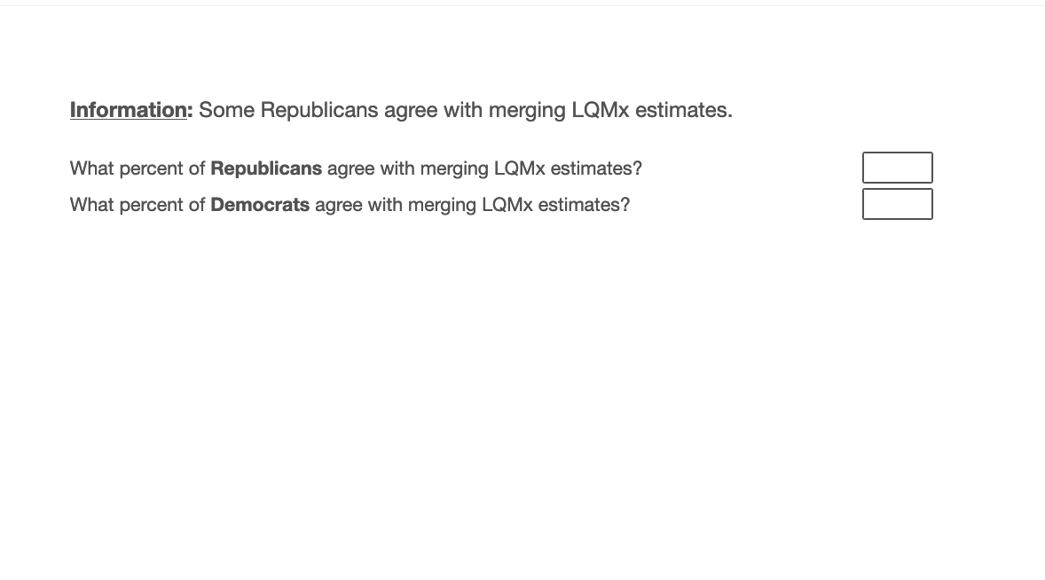
Here is a question in one block:
They both have the same HTML formatting and the same text box width (60px) but in preview the text boxes look very different. This doesn’t make snese.