Hi Everyone,
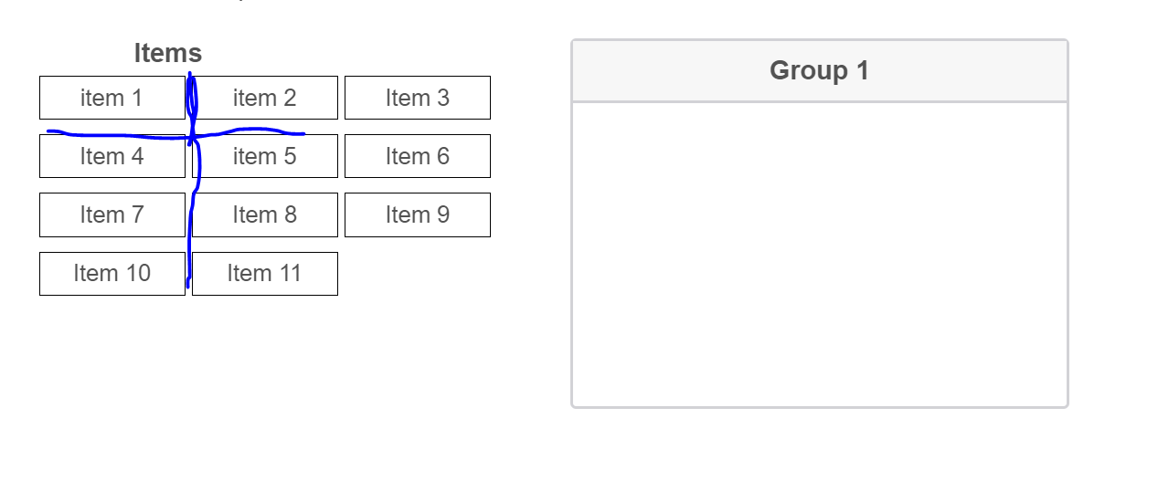
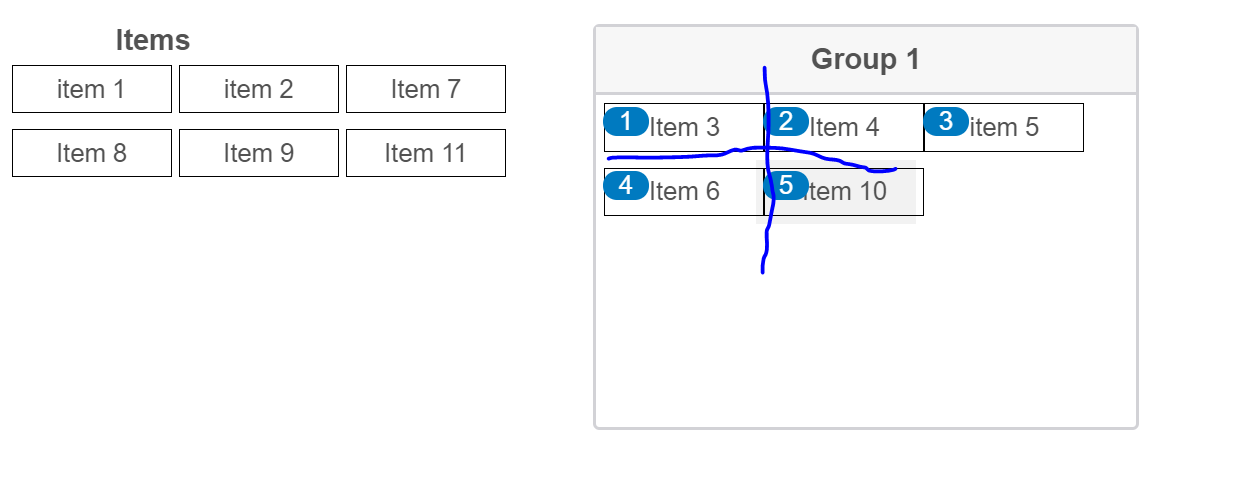
I am currently using the "Drag, Drop and Rank" question and I have quite a few items in each question. So I try to present items in multiple columns. Thanks to the codes shared in the forum, I have been able to do so and to add borders on each item. However, the space between items becomes very tight, horizontally or vertically, as shown in the screenshots
Does anyone know how to increase the space between items?
Thank you in advance!

There is css code that I am using, which is adapted from the forum.
labellid^="QID"] {
width: 100px;
border: 1px solid black;
padding: 5px;
display: block;
}
.Skin .PGR .DragAndDrop .QuestionBody table {
width: 100%;
}
.Skin .PGR .DragAndDrop .Items {
width: 350px;
}
html>body .Skin .PGR .DragAndDrop .Items>ul {
width: 100%;
}
.Skin .PGR .DragAndDrop .Items>ul>li {
display: inline-block;
width: 100px!important;
padding: 5px!important;
}
.Skin .PGR td.groupsContainerTd {
width: 380px;
min-height: 450px;
height: 450px;
}
.Skin .PGR .DragAndDrop .Group>div>ul, .Skin .PGR .DragAndDrop .Items>ul,
.Skin .PGR .DragAndDrop .NoColumns td.groupsContainerTd div ul {
width: 100%;
}
.Skin .PGR .DragAndDrop .QuestionBody .Group>div>ul>li {
display: inline-block;
width: 100px!important;
padding: 5px!important;
}
.Skin .PGR .DragAndDrop td.groupsContainerTd div > div {
min-height: 250px;
height: 250px;
}
.Skin .PGR .DragAndDrop .QuestionBody span.LabelWrapper label>span {
display: block;
}
Page 1 / 1
Try using below CSS:
.Skin .PGR .DragAndDrop .QuestionBody .Group>div>ul>li , .Skin .PGR .DragAndDrop .Items>ul>li{
margin: 10px;
}
It works well. Other problems are also solved. Thanks a lot!
Leave a Reply
Enter your E-mail address. We'll send you an e-mail with instructions to reset your password.
