Greetings all,
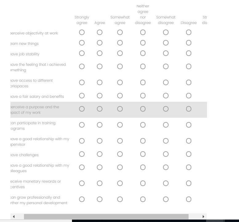
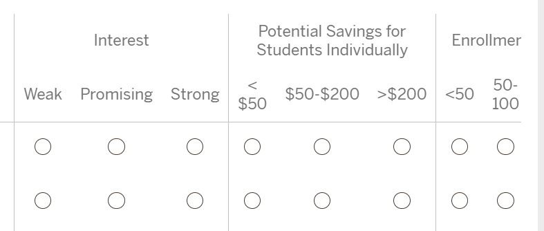
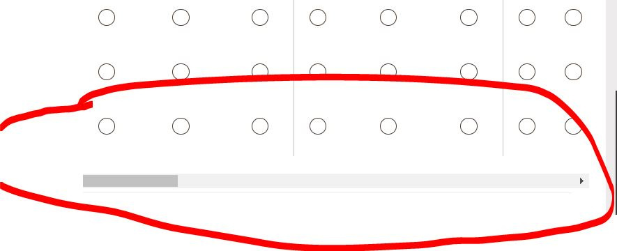
I've been banging my head against the wall as I cannot get a basic matrix table to display correctly. I have looked at other questions related to this and most appear unanswered or the solutions do not seem to work for me. I have a survey with a series of blocks, most with just a single matrix question in each. Most of these are using a 7 item scale (strongly disagree to strongly agree), and unless I set it so the statement text is displayed quite frankly, stupidly narrow, I cannot get all 7 scale options to display without a horizontal scroll bar. Below are examples of how it looks when I make the statement text (somewhat) readable, vs how narrow I have to make the statement text in order to fit the full scale.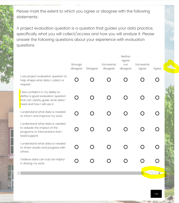
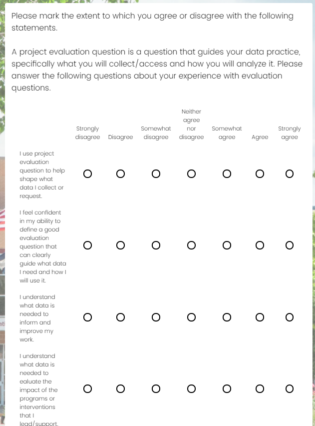
I should not have to decide between the user seeing the full scale (should always be a given) and the statement text only showing 1-4 words per line (very bad for statement comprehension and visually just looks terrible). I have tried adding both the following script to the Look & Feel custom CSS page:
jQuery(".Skin .SkinInner").css({"min-width": "90%"});
and:
jQuery(".Skin .SkinInner").css({"min-width": "1200px"});
Neither had any effect, so I added them to a specific question script and it did the following: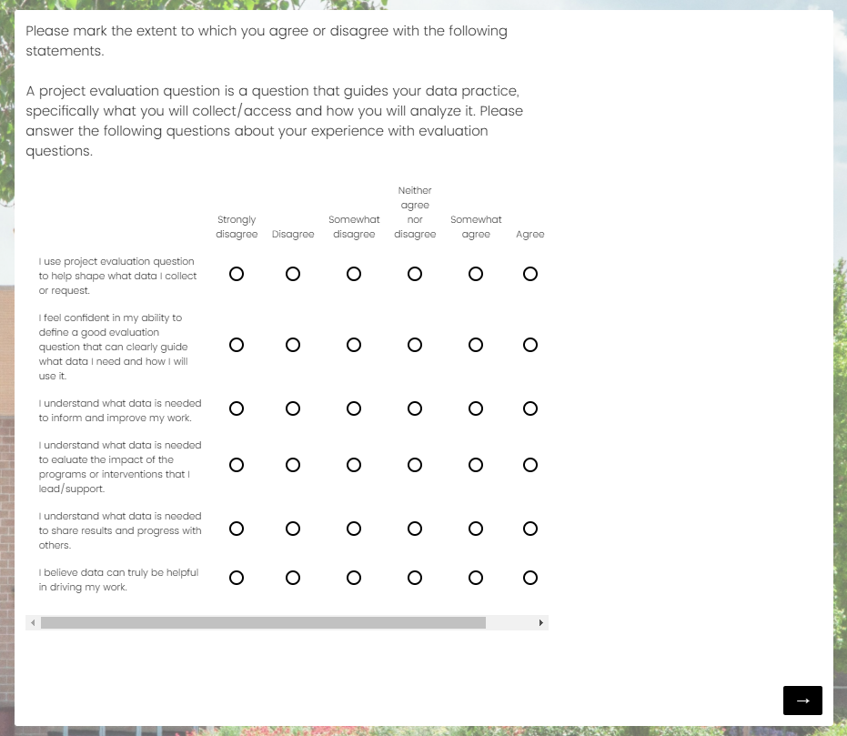
So i guess I really have a few questions...
1) How do you change the width of the matrix table itself
2a) Is there a way to change all matrix table questions so they are the same as opposed to just eyeballing how much width you are giving the statement text for each individual block
or
2b) Is there any way to actually see what the table will look like as you are adjusting it? I guess I don't understand the logic behind showing your survey on the backend a completely different way then it will appear for your users...
3) What is the base width set to? Is there a way to permanently change this? It seems very narrow given most modern display dimensions.
Matrix Table Scale Cut off - Why is my survey so narrow???
 +2
+2Sign up
Already have an account? Login

Welcome! To join the Qualtrics Experience Community, log in with your existing Qualtrics credentials below.
Confirm your username, share a bit about yourself, then you're ready to explore and connect .
Free trial account? No problem. Log in with your trial credentials to join.
No free trial account? No problem! Register here
Already a member? Hi and welcome back! We're glad you're here 🙂
You will see the Qualtrics login page briefly before being taken to the Experience Community.
Login with Qualtrics

Welcome! To join the Qualtrics Experience Community, log in with your existing Qualtrics credentials below.
Confirm your username, share a bit about yourself, then you're ready to explore and connect .
Free trial account? No problem. Log in with your trial credentials to join. No free trial account? No problem! Register here
Already a member? Hi and welcome back! We're glad you're here 🙂
You will see the Qualtrics login page briefly before being taken to the Experience Community.
Login to the Community

Welcome! To join the Qualtrics Experience Community, log in with your existing Qualtrics credentials below.
Confirm your username, share a bit about yourself, then you're ready to explore and connect .
Free trial account? No problem. Log in with your trial credentials to join.
No free trial account? No problem! Register here
Already a member? Hi and welcome back! We're glad you're here 🙂
You will see the Qualtrics login page briefly before being taken to the Experience Community.
Login with Qualtrics

Welcome! To join the Qualtrics Experience Community, log in with your existing Qualtrics credentials below.
Confirm your username, share a bit about yourself, then you're ready to explore and connect .
Free trial account? No problem. Log in with your trial credentials to join. No free trial account? No problem! Register here
Already a member? Hi and welcome back! We're glad you're here 🙂
You will see the Qualtrics login page briefly before being taken to the Experience Community.
Enter your E-mail address. We'll send you an e-mail with instructions to reset your password.


