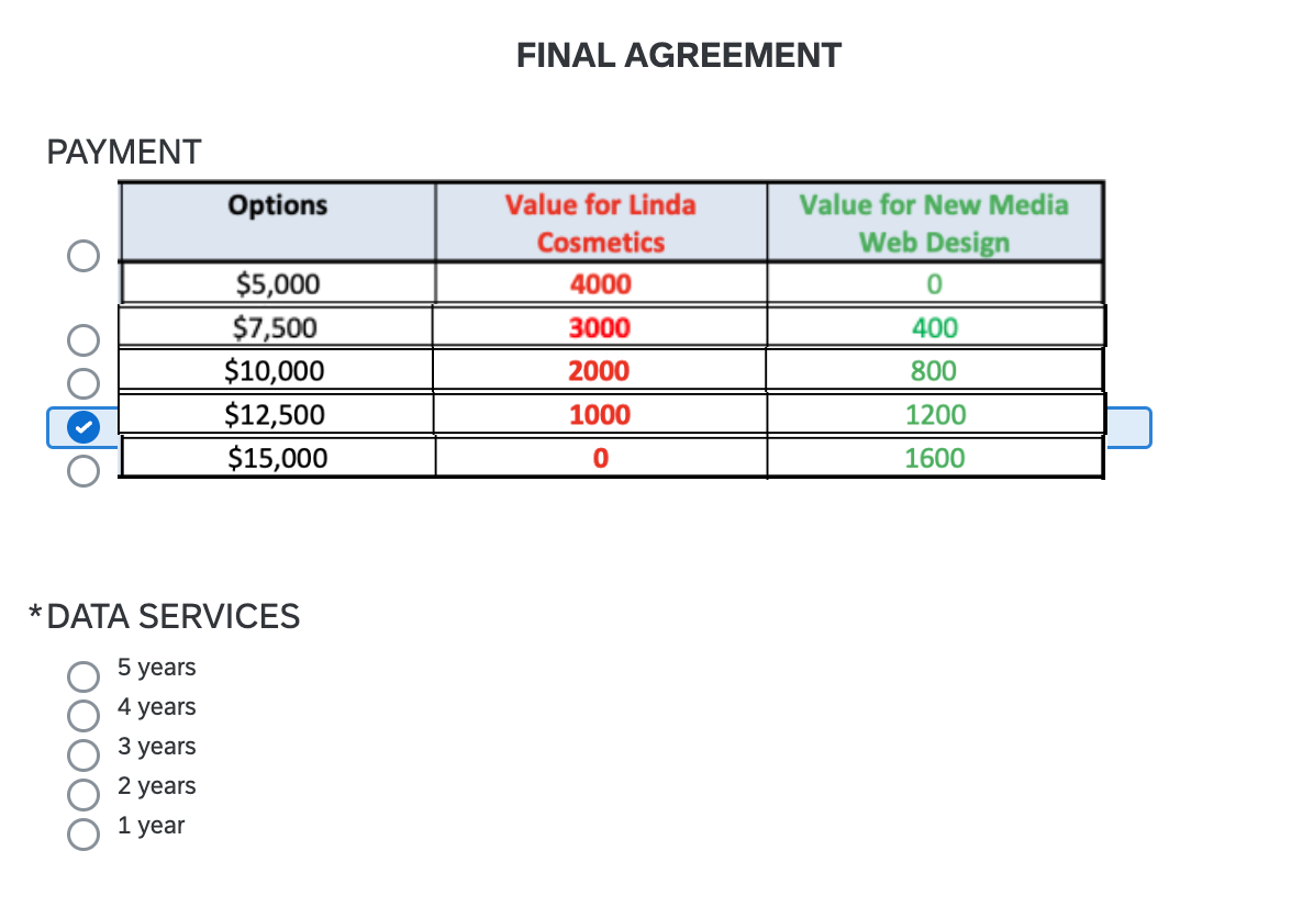
Have tried using look and feel (compact), java script and CSS but nothing seems to working.
I have a multiple choice question with five options (answers are displayed vertically). Instead of text, I have included an image for each option. Does anyone know of a solution to reduce the space between multiple choice options? I want there to be little space between the options so it looks more like a table potentially.
Any tips/tricks would be really helpful. Thanks in advance!
Page 1 / 1
Assuming you are using simple layout, we can use below CSS in the HTML view of the question text:
@Shashi , you are a life saver! That worked (yes, I was using simple layout). I will play around with the spacing (see attached) but it worked great!!
Another quick question, any good way of reducing space between the two multiple choice questions? As in the white space between the Payment question and the Data Services question? Thanks!!
I want to adjust the distance between the response options. The response options are some shapes (for some questions in vertical form and for some other questions in horizontal form).
For instance. there should to small clickable squares that subject has to click on one of them. for each question, the distance between squares will change (e.g., 1 inch distance between the two squares in the first question, 1.5 inches in the second question, 2 inches in the second question, etc)
I would appreciate it if you could help me with that and guide me on how to do it.