Hello Everyone,
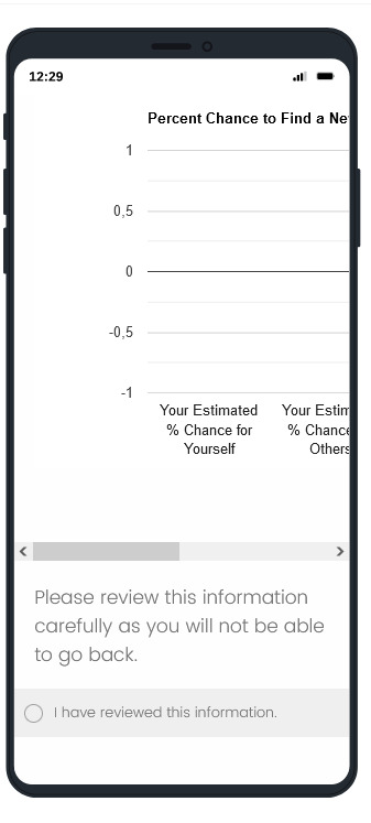
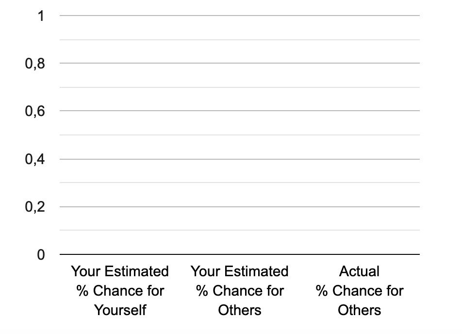
Could anyone share with me some advice on resizing the attached graphic depending on the screen width of the respondent's device? I would like to avoid respondents having to use the slider in the mobile version to see the whole graph. In addition to screenshots, I am also attaching the code below.
Many thanks!
Chantal
---
 This is the html code in the header:
This is the JavaScript that produces the graph:
google.charts.load("current", {
packages: ['corechart'], 'language': 'pt'
});
google.charts.setOnLoadCallback(drawChart);
function drawChart() {
var data = google.visualization.arrayToDataTable([
["Estimate", "Percent", { role: "style"}],
["Your Estimated \\n % Chance for \\n Yourself", estimate_own__plot, "#D3D3D3"],
["Your Estimated \\n % Chance for \\n Others", estimate_other_plot ,"#1F4E79"],
["Actual \\n % Chance for \\n Others", prediction_other_plot, "#90EE90"],
]);
var view = new google.visualization.DataView(data);
view.setColumns([0, 1,
{calc: "stringify",
sourceColumn: 1,
type: "string",
role: "annotation"
},
2]);
var options = {
title: "Percent Chance to Find a New Job within \\n 3 Months",
width: 600,
height: 400,
vAxis: {
viewWindow: {
min: 0},
format: '#.#' },
fontSize: 15,
bar: {
groupWidth: "67.5%"
},
legend: {
position: "none"
},
};
var chart = new google.visualization.ColumnChart(document.getElementById("columnchart_values2"));
chart.draw(view, options);
}
});


