Trying to widen my survey with CSS or JavaScript | XM Community
Skip to main content

Hello!

I am trying to widen my survey content so that there isn’t as much white space on either side of my question. Currently, the survey content is centered in the middle but when I try to widen the question by widening the columns within Qualtrics, I am given a side scroll bar to navigate to the end of the question rather than the survey widening to display the question across the page. Here’s a screenshot below of how it looks: 
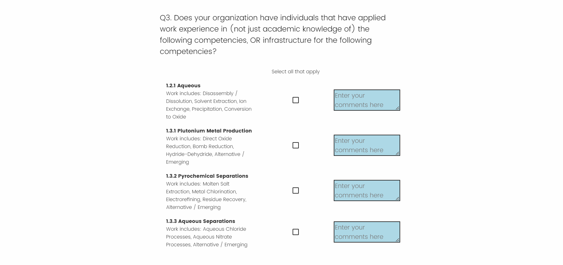


I am trying to use CSS or JS to accomplish this, and I have been trying to locate the survey div in the html inspection. Here’s the CSS code I’ve been trying so far: 

.JFE .JFEContent.SkinV2.webkit.CSS3 .Skin #Wrapper .SkinInner {
    max-width: 80%; /* Adjust this percentage to your desired width */
    margin: 0 auto; /* This centers the container */
}
 

Appreciate any help!

@at3gk , yea, that “side bar scrolling” is really annoying! I try to avoid it as much as possible, even to the point of changing my question type. We are really trying to push a “mobile-first” approach on all our surveys, and that question type you are using above is difficult to pull off on mobile. That being said, CSS is not going to work in this case cause you are trying to change the object perimeters, not the formatting of the object. How are your JS skills? Mine are not strong enough to give you the code you need to accomplish this, but others on this forum may be able to help. My personal approach would be to investigate an alternative question type. 


Try this,

jQuery('.c4').css('width','20%')

Here c4 is the class for the middle column and reduce the size as required.


Leave a Reply