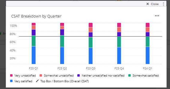
I would like to create a chart like the one below where the line is the CSAT score for that quarter, comparing the breakdown and the overall score. Currently, the comparison line will only show the current CSAT score instead of changing with the associated survey date (quarter). Has anyone else accomplished this a comparison where the line matches the x-axis date?
Page 1 / 1
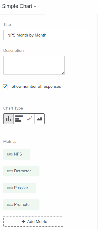
Hello! I am so excited to share with you that YES, this is possible! Please create your widget using a Simple Chart (note: this is a Deprecated Widget; however, it is the only way I’ve found to support this still. I am hopeful the newer versions of the widget will support this). Then, instead of adding it as a comparison, add it as its own metric, as seen here with overall NPS rather than the breakout of NPS Group:
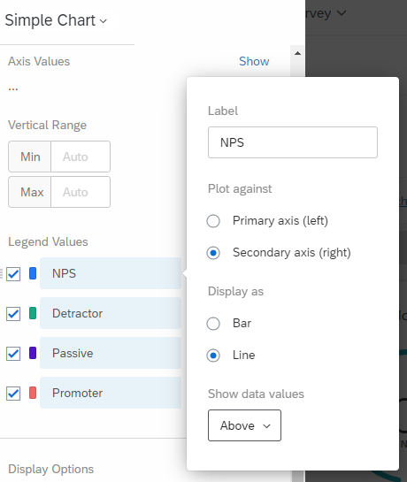
Then, scroll down to where you adjust the colors, and you can set it up to be a line
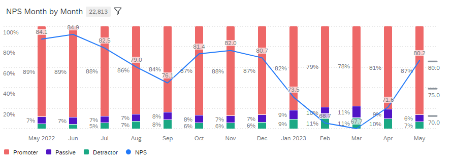
Then, you’ll be able to see a widget that looks similar to this:
I hope this is helpful! Have a great day.
This is amazing! Thank you for your help. I didn’t know this was possible. As simple as clicking on the names where the colors are changed. :)
I’m so glad I could help! It’s hidden for sure, but a very powerful way to visualize data in the Dashboard!