Dashboad question - Line chart issue | XM Community
Skip to main content

Hi,

I am trying to create a line chart in my dashboard from the following:

The lines are the responses from Q6 in my survey. There are only 2 possible responses either Pos or Neg.


I want the x-axis to be Recorded Date however I want the x-axis to show each month of the year separately.

I basically want to see for each month how many responses of each Pos and Neg.

Can someone please show me the steps to achieve this line chart?


Cheers,

Chris 

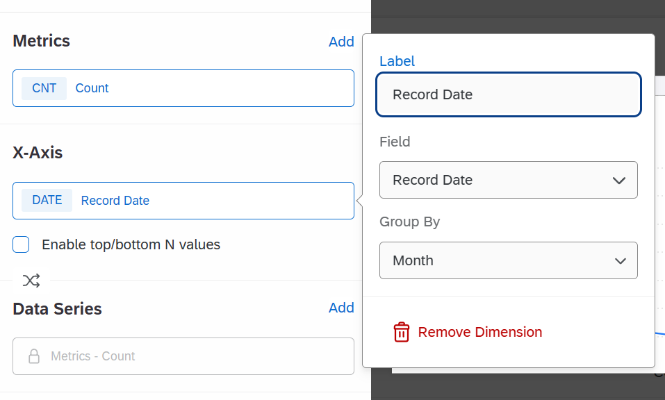
Hi @Al-Fairy, In your line-chart set-up. Set Metrics as Count. X-Axis with record date that group by Month and Data Series as your Q6 field (Text-set)

Hope this helps


Thanks Nam Nguyen,

I figured out what to do. For the lines, I added a metric for each of the options in Q6, then click on the filter option within the metric popup. Then choose the question and the value that I want the metric to show. Then I repeated that process for the second option.  


Thanks Nam Nguyen,

I figured out what to do. For the lines, I added a metric for each of the options in Q6, then click on the filter option within the metric popup. Then choose the question and the value that I want the metric to show. Then I repeated that process for the second option.  

@Al-Fairy Yeah, that’s another option. You can create seperate line with filter or breakdown the original metrix with data series as i recommend.


Leave a Reply