Dashboard data display help - what is the source of truth? | XM Community
Skip to main content

Hi Everyone

Hope you all had a nice weekend. 🤞

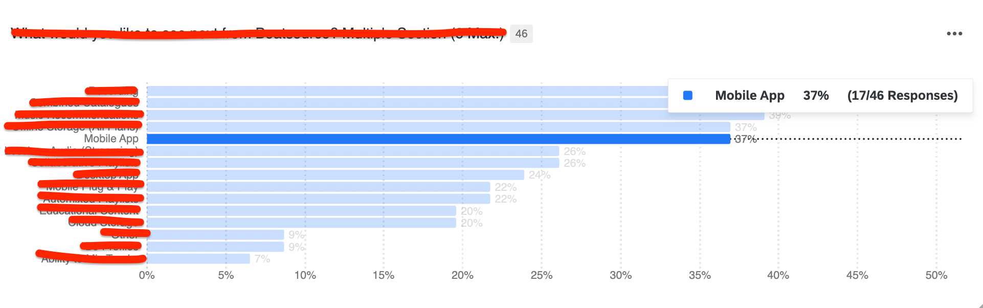
I have a multiple choice question as per the below.

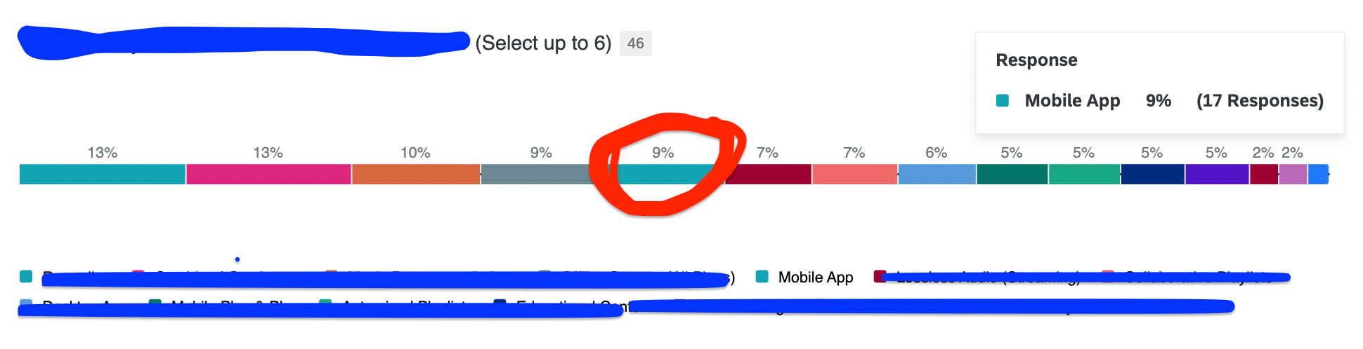
As you can see Mobile App had 17 responses, which was 9% when taking into consideration the other multiple choice options. The results have been stacked and normalised using a horizontal bar widget.

But….

17 responses of the total responses (46) is approx. 36.9%.

So what what is correct?  Or are they both correct?  9% or 36.9%?

I just want to ensure the data is presented correctly and not misleading to colleagues.

The reason I have highlighted Mobile App is because this is the focus of the survey, and we need this data to help drive a decision but I am unsure how to represent this accurately. 

Thanks :)

Hi,

36.9% of the 46 respondents have selected the mobile app. 

In total, those 46 respondents have selected something like 190 answer options (since you had multi select). So the 17 mentions is 9% of all 190 mentions.

In my view, you should not use this chart! You should not sum up a multi select question to 100%.


Got it! So with that in mind, a good best practice it not to normalize multiple section questions.

This would work better?

Thanks :)


This would work better?


Yes, that’s exactly how I am displaying multiple choice questions.


Super! Thanks for your help!


Leave a Reply