How to combine multiple fields into one chart? | XM Community
Skip to main content

I have a question asking about what publishers you engage with followed by a question about how you engage with each publisher. This leads to multiple fields: 

field 1: publishers you engage with 

field 2: how you engage with publisher A 

field 3: how you engage with publisher B 

field 4: how you engage with publisher C


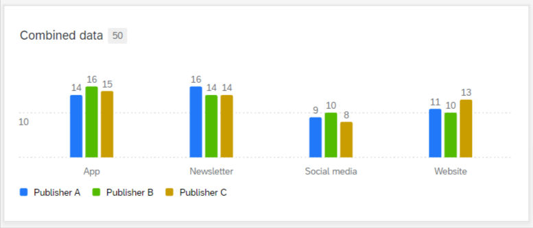
I am wondering if it is possible to create a visualisation where you have how you engage with publisher A B and C in the same chart? (i.e. a different coloured column for each publisher). 


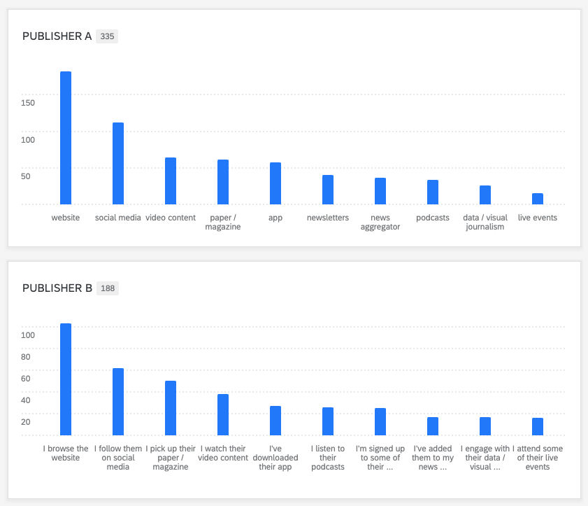
Right now I only have a chart for each publisher:
 

Hi @jmmf,


Can you please give more details or maybe a screenshot of your survey questions ?

Are we talking about differents questions with the exact same response choices ?


I made a quick test and I think a measure group in dashboard data should respond to your needs :


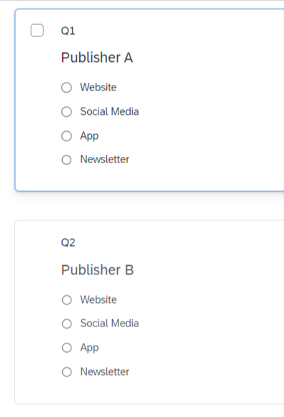
My survey setup:


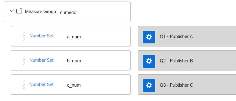
My data mapping:


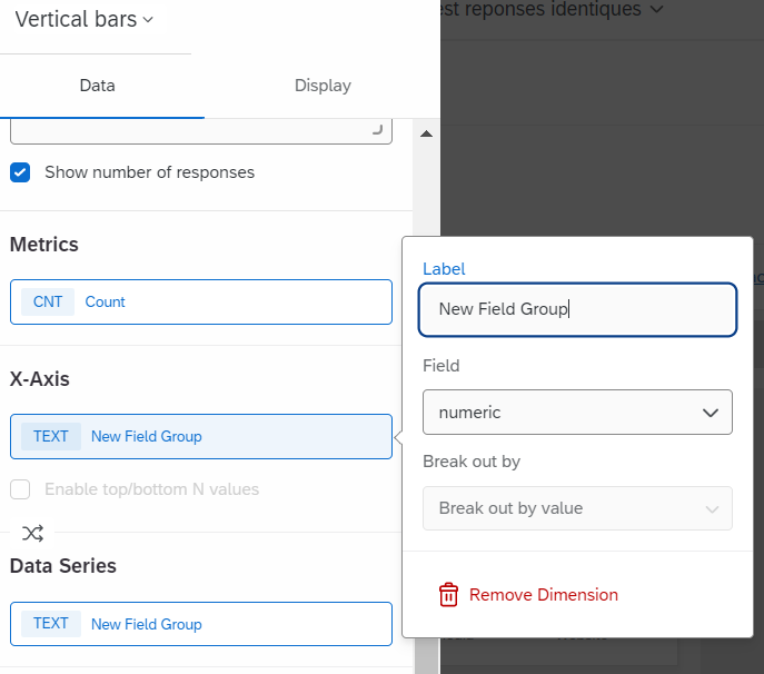
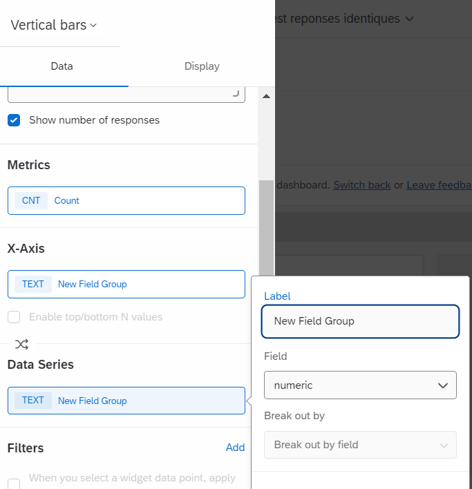
My widget setting:


Using numeric values, but i changed the displayed name in the legend and axis label setup


Hi @ElieD this looks great! Same question and same response options for each, yes. 


I was wondering what the reason is to use numeric values instead of text values? It’s a bit cumbersome having to change the display name every time but I understand if it’s necessary for the data to display correctly. 


There are different kinds of measure groups in the data mapping.

I tried a generic group with text set values but it doesn’t work like I wanted in the widget.

Measure group is available only for numeric values, but it is exactly what drives the widget as you need.


Leave a Reply