Hi all,
I'm struggling with the interpretation of the Key Drivers widget.
I went through the documentation, but I'm still lost.
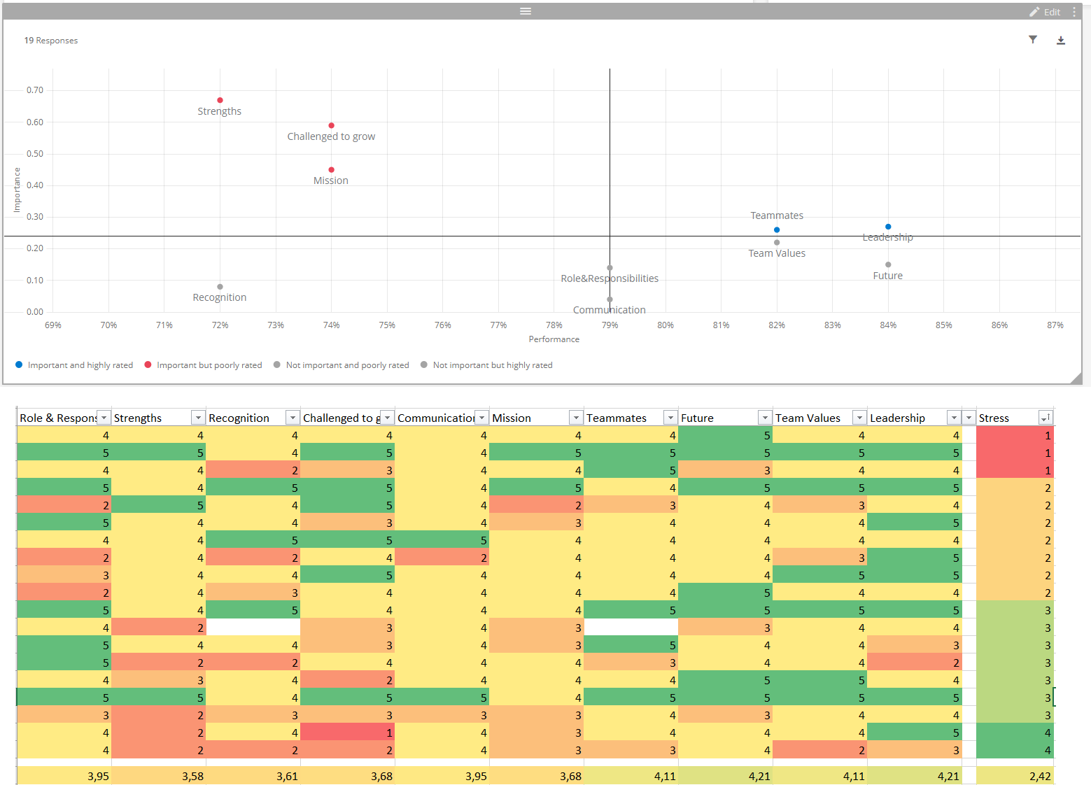
Here is a screenshot of my widget and my raw data (raw data with conditional formatting in Excel). I have dynamical thresholds.
My drivers are 5-point-scale questions (how much do you agree with... from strongly agree = 5 to strongly disagree = 1).
My outcome is a 4-point scale question about stress. I have already recoded this variable in both directions, but the widget stayed EXACTLY the same.
Currently the screenshot shows 1 = much stress (bad) and 4 = little stress (good), to be consistent with the drivers were also high score = good.
So the X-axis for performance, that one I get: the drivers are ranked according to their average (also in my excel I calculated the averages below and these match with where the point is on the X-axis.
But the Y-axis for Importance is the one I have trouble with.
So I can see that "Strenghts" is the driver the most top-left. So it has a high impact. But we're scoring low on it on average.
When I look at my raw data table, I can see that the people with the best stress score, have the worst strengths score... so there's a correlation, but a negative one? Meaning we wouldn't want to try to get our performance up on that point? Which seems contra-intuitive as an interpretation, which is why I was doubting how to interpret...
Can someone help me get some clarity here :)
Thanks!
Interpretation Key Drivers widget
Sign up
Already have an account? Login

Welcome! To join the Qualtrics Experience Community, log in with your existing Qualtrics credentials below.
Confirm your username, share a bit about yourself, then you're ready to explore and connect .
Free trial account? No problem. Log in with your trial credentials to join.
No free trial account? No problem! Register here
Already a member? Hi and welcome back! We're glad you're here 🙂
You will see the Qualtrics login page briefly before being taken to the Experience Community.
Login with Qualtrics

Welcome! To join the Qualtrics Experience Community, log in with your existing Qualtrics credentials below.
Confirm your username, share a bit about yourself, then you're ready to explore and connect .
Free trial account? No problem. Log in with your trial credentials to join. No free trial account? No problem! Register here
Already a member? Hi and welcome back! We're glad you're here 🙂
You will see the Qualtrics login page briefly before being taken to the Experience Community.
Login to the Community

Welcome! To join the Qualtrics Experience Community, log in with your existing Qualtrics credentials below.
Confirm your username, share a bit about yourself, then you're ready to explore and connect .
Free trial account? No problem. Log in with your trial credentials to join.
No free trial account? No problem! Register here
Already a member? Hi and welcome back! We're glad you're here 🙂
You will see the Qualtrics login page briefly before being taken to the Experience Community.
Login with Qualtrics

Welcome! To join the Qualtrics Experience Community, log in with your existing Qualtrics credentials below.
Confirm your username, share a bit about yourself, then you're ready to explore and connect .
Free trial account? No problem. Log in with your trial credentials to join. No free trial account? No problem! Register here
Already a member? Hi and welcome back! We're glad you're here 🙂
You will see the Qualtrics login page briefly before being taken to the Experience Community.
Enter your E-mail address. We'll send you an e-mail with instructions to reset your password.


