Hi Everyone
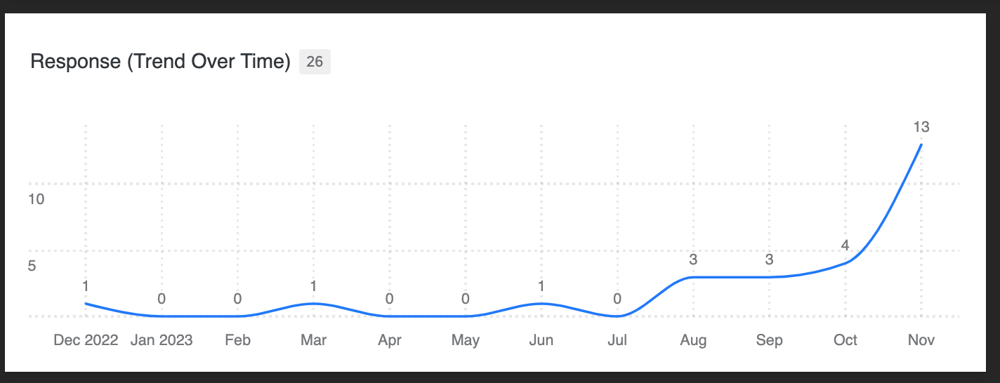
I have the below lines widget on my dashboard.
I have mapped the X-Axis to an emended data field that consists of a date, the metric field is then mapped to count, and is grouped by month.

It’s working well so far, but I would like to map an additional emended data field that also consists of a date to the X-Axis – so I can compare both overtime. I can only seem to map x1 X-Axis value.
My goal is that the widget would show X in blue (working), and X in green for example (needed).
Hope you can help :)
