Hey Qualtrics team!
I’d like to open a discussion to discover if there’s a way to create a ‘30-rolling-days’ average for the sentiment score so we can see
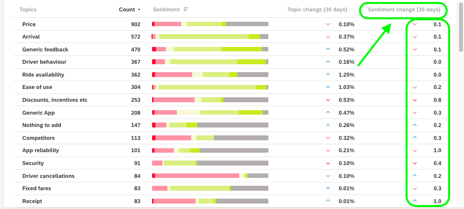
- In the ‘TextIQ’ table widget, I’ve included the ‘Sentiment change’ column whose period of analysis is 30 days:
-

I’ve also created a Line widget to see how Sentiment score is changing. In this case the period of analysis is the ‘month’ (x-axis)
-

I’d like to build this ‘line’ graph so when comparing the ‘score’ now with the score 30 days ago then we could see the initial score and the final one.
-
For instance:
-
In ‘TextIQ’ table widget we can see that the Sentiment score has changed -0,8 for the ‘Discounts, incentives, etc’ topic.
-
In the Trend widget, I want to know which was the initial sentiment score for this topic and which is right now, so this different (old vs new) is -0,8: exactly the one reflect in the ‘Sentiment change’ column.
-
Do you know if there is a way to do that? Any recommendations?
Thanks for your help!


