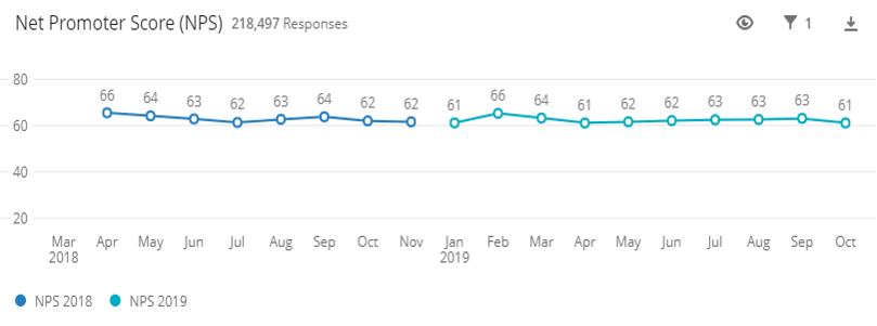
I am trying to show trended NPS data in a widget. We generally show our data like in the graph below.
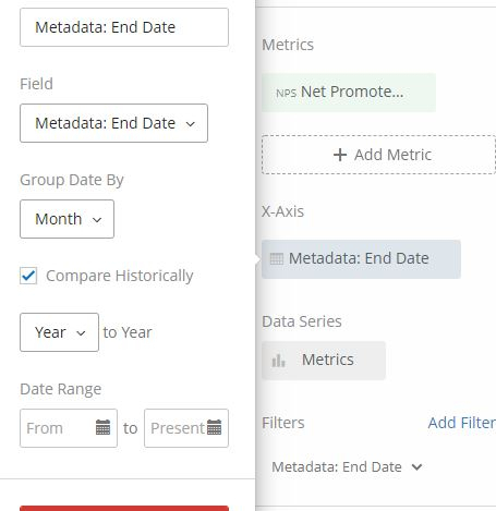
However my execs would like to see a year over year comparison, by month - so have the dark blue line and light blue line on top of each other, so it's easier to compare NPS by month (ex: May 2018 vs. May 2019). I tried to "play" with the settings but couldn't find a way by myself.
Has any of you tried? Any ideas? Thanks so much in advance!
!
Best answer by vwilkison
View original")