Hello CX Dashboard Community,
I wanted to reach out and ask if there is anyone in the community who would like to share pictures of the design of their dashboards and text IQ pages? 
I wanted to find more ideas for page designs and widget placement and structures but i could find so much online.
I would greatly appreciate the help!
Sincerely,
Nick B.

TEXT IQ & DASHBOARD EXAMPLES
 +2
+2
I am interested in this also. I have asked both Qualtrics and our support agency but that has not returned much other than links back to Qualtrics support pages.
I think the above example from NPSadmin2020 is useful.
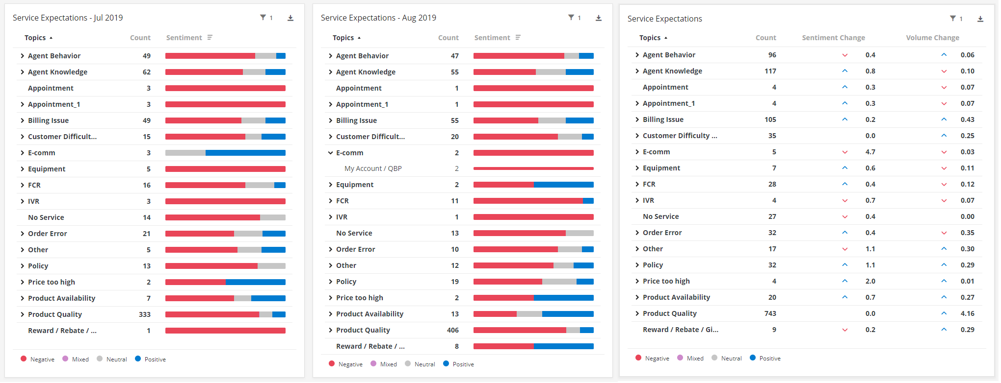 iQ tables provide an alternate to the bubble chart. Could also use the bubble chart beside the far right %change iQ table but drilling on bubble doesn't drill the table. Chart 1 could be 'This Month' and Chart 2 could be 'This Month' offset by 1 month. Then compare the two for MoM...

I'm in the same boat and just posted a similar question. The bubble chart just isn't hitting the mark. What are customers saying and how has that changed M/M? Is it more positive? Hopefully someone will feel generous and reach out to share!

Userlevel 2
 +5
+5
No examples sadly but I would be very interested in this too. I have been struggling to set up dashboards that are a little more complex than the usual simple widget, because the guides are not very conclusive.
Leave a Reply
Enter your username or e-mail address. We'll send you an e-mail with instructions to reset your password.