
I tried searching for an answer in the Community without finding anything, but I am wondering if there is a way to have a stacked bar chart so the total of the two data series.
Example:
We track our satisfaction by five ‘seasons’ and I would like to show the breakdown of the top two (4 & 5) responses to reach out total score. However, I cannot find a way to do this.
My metric is set up as Count with value as % of Y-axis breakout. My Y-axis is the seasons, and my data series is the satisfaction categories. However, when I change my metric to Top Box/Bottom Box and use CSAT as the field and just the top two answers, the percentages turn to 100%.
Ideally, but totals would appear at the end of the bars for Spring and Summer, with the category value appearing above the bar.
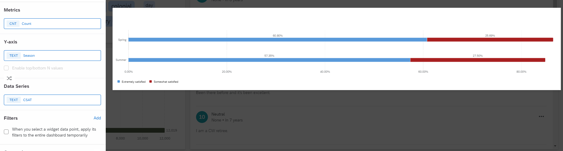
Any thoughts?