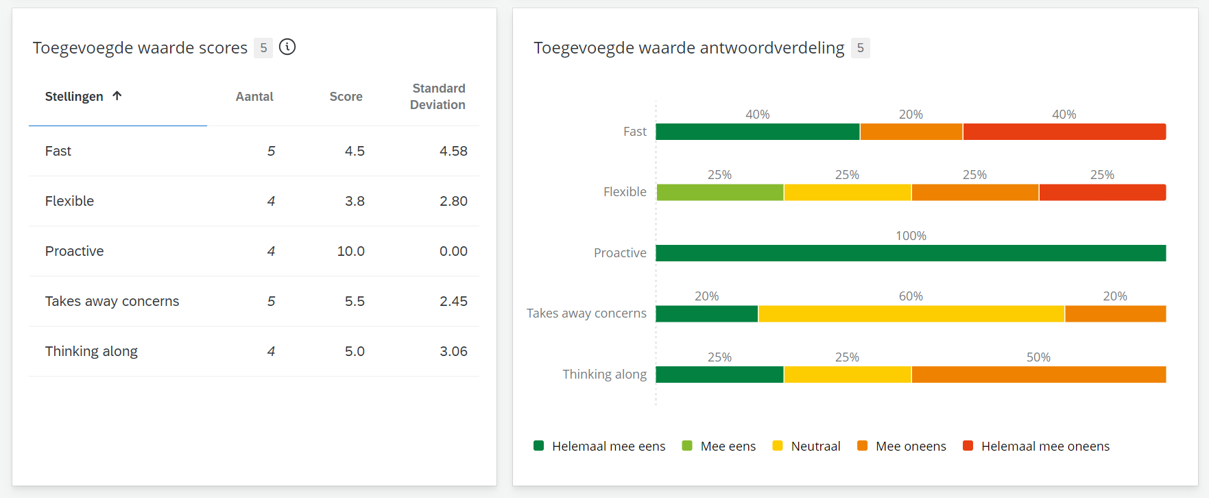
Here's my issue: I'm looking to represent Likert-scale multiple-choice questions in tables with average scores and breakdown charts. Additionally, I want to indicate the number of respondents who selected "not relevant" for each specific question.
Here's some background information:
In a Qualtrics survey, I have several Likert-scale questions with response options like "completely agree," "agree," "neutral," "disagree," "completely disagree," and "not relevant." Typically, these options are converted to a numerical scale from 1 to 6. However, in my case, I've recoded them into a 10-point scale, excluding the "not relevant" option from the analysis.

This approach works well for visualizing the data on my dashboard, where I aim to display groups of statements in table format along with their averages, count, and benchmarks. I can also sho response distributions by making a stacked horizontal bar chart with Top/Bottom boxes for each option.

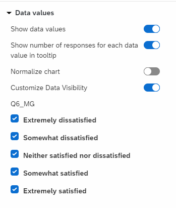
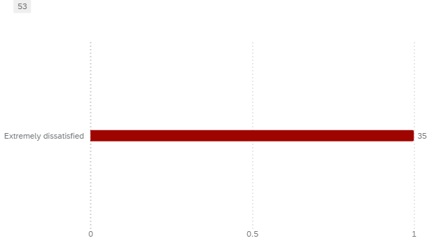
My challenge is that I can't find a way to display how many respondents selected "not relevant" for a specific question. I could leave the "not relevant" option included and create six separate parts (top and bottom) in a bar chart widget, but this would distort the averages due to the presence of the "99" value.
In the survey, it's possible to recode the "not relevant" option as null, but unfortunately, in the Dashboard Data recoding, this option is not allowed. It either excludes the option altogether or assigns a numerical value to it.
How can I solve this?


