Visualizing Topic Sentiment Score | XM Community
Skip to main content

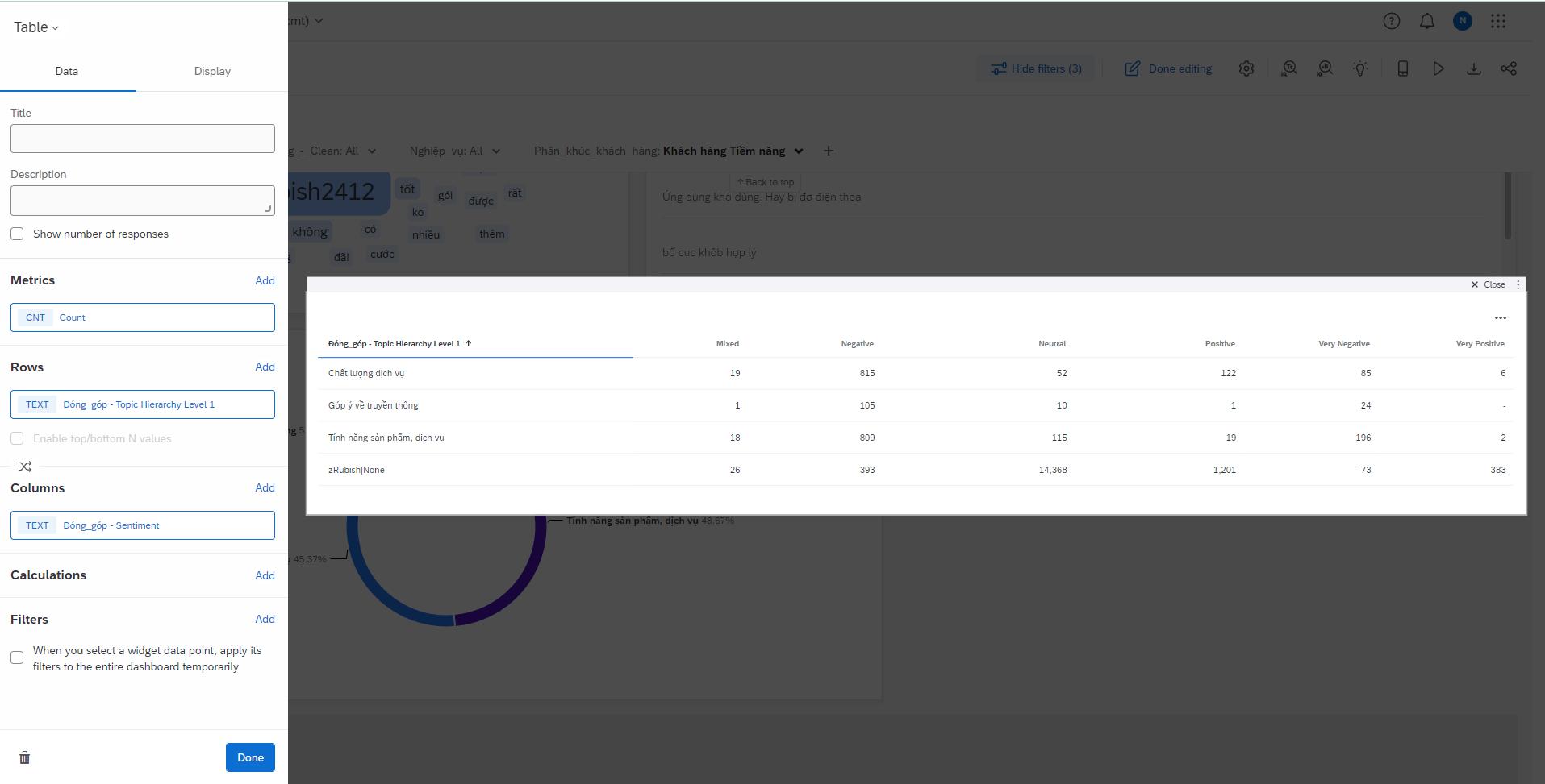
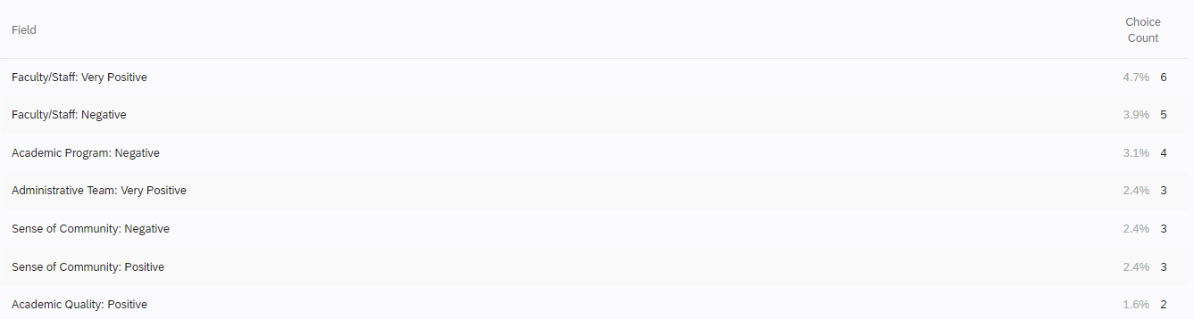
I have a list of topics analyzing my open-ended responses and I would like to create a visualization showing an aggregation of the sentiment labels in a more precise way than what is currently available. Current visualizations show each topic sentiment label as a separate line in a table. Example:


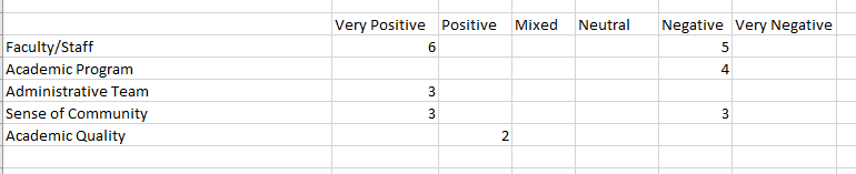
What I would prefer (and what would be more readable) would be a table that shows a topic as the row and then a column for each sentiment label. Example:


Is there a way to do this with the current system? Or a way to do something similar? I’ve played around with both the old and new Results tab visualization options and I can’t seem to find a good solution.​​​​​​​

@AnnaHar Add a table widget: Metric: Count, Row: Topic, Collumn: Sentiment
Let me know if it helps


OH MAN. You are a flippin hero. I swear, I tried that but the trick is picking  “Sentiment” instead of “Topic Sentiment Label”. Thanks so much!


@dxconnamnguyen  Not sure why, but the counts are wrong. Any idea why that might be?


@dxconnamnguyen  Not sure why, but the counts are wrong. Any idea why that might be?

Mine is correct, I don’t know what happened to yours.


@dxconnamnguyen  Not sure why, but the counts are wrong. Any idea why that might be?

Mine is correct, I don’t know what happened to yours.

Ok thanks. I’ll dig into it and see if I can figure it out. I appreciate your help!


Ok thanks. I’ll dig into it and see if I can figure it out. I appreciate your help!

Topic sentiment and overall sentiment is different. A comment might negative with topic A, positive with topic B and overall sentiment is Mixed. You might wanna check on that


For anyone else who finds this topic: After talking to support, it looks like there’s not a way currently to do that type of table for Topic Sentiment without each Sentiment Label having it’s own row.


Leave a Reply