Can not combine a group of answers under one question into a single graph. | XM Community
Skip to main content

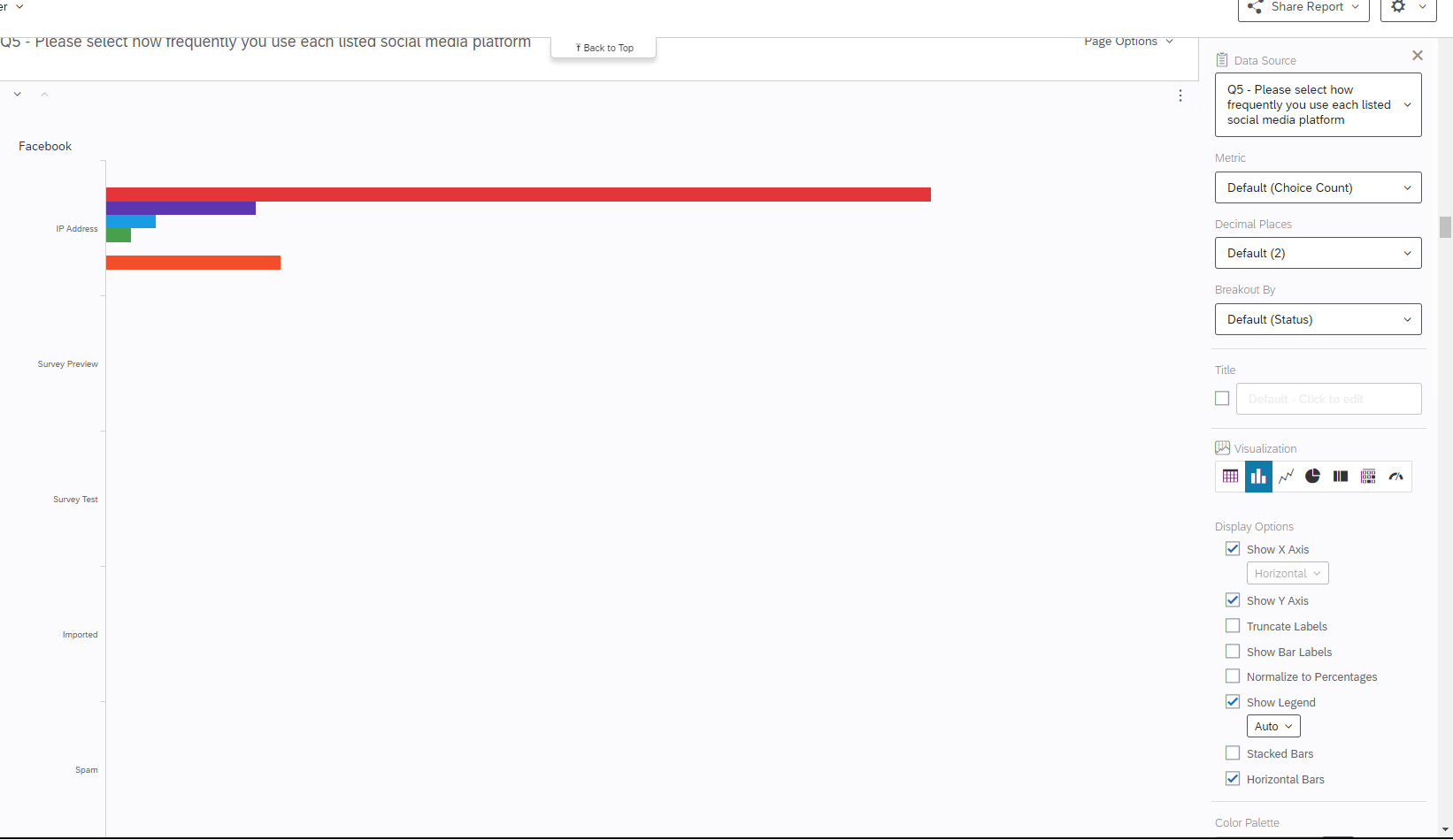
Standard survey with questions regarding social media use. We are trying to determine how many hours per day a participant spends on different social media platforms. Rather than grouping the results into a single graph with the x axis being hours spent and the y axis being social media platform, it has become 6 different graphs for each social media platform, with the y axis becoming the medium for which the respondent used to answer the survey (see picture). We can't figure out what is going one, any solutions?
 

@acloudwithfeet 

You can create measure group on dashboard and create that visualization on results tab you wouldn’t be able to get that visualization.

Hope this helps!


@acloudwithfeet ,

@Deepak  has identified my recommended path forward on this as well. Creating a Measure Group in the “Settings” area of the Dashboard, and then using a Vertical or Horizontal Bar Chart is the best way to visualize what you are referring to. Here is a link for your convenience on that process: 

https://www.qualtrics.com/support/vocalize/dashboard-settings-cx/dashboard-data/advanced-fields/field-groups/#CreatingAMeasureGroup

But the thought also occurred to me that you might be trying to create the visualization in Survey Reporting because you might not have access to Dashboards? Does your license include Dashboards? If not, repost here and perhaps there is another way to accomplish what you are looking for. But I think you will really like the Measure Group combined with the Bar Chart result if you have Dashboards. 


Leave a Reply