Hi, I am wondering can you show a breakdown of the new responses in the last week in a line chart in the dashboards? How would I create a trending line based on the number of new responses each week?
Thanks!

 +3
+3Hi, I am wondering can you show a breakdown of the new responses in the last week in a line chart in the dashboards? How would I create a trending line based on the number of new responses each week?
Thanks!
Best answer by Sachin Nandikol
Hello
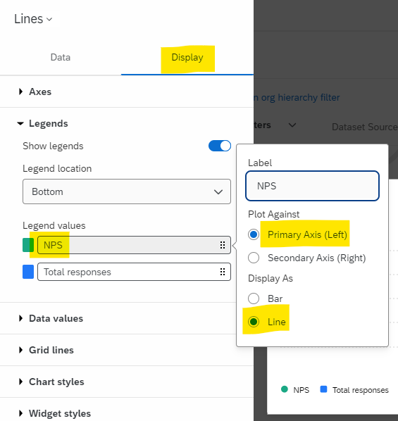
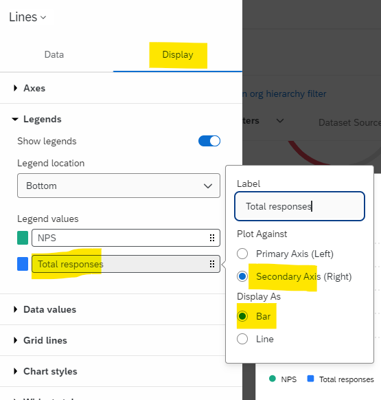
Configure your line chart following the instructions provided in the screenshots below:

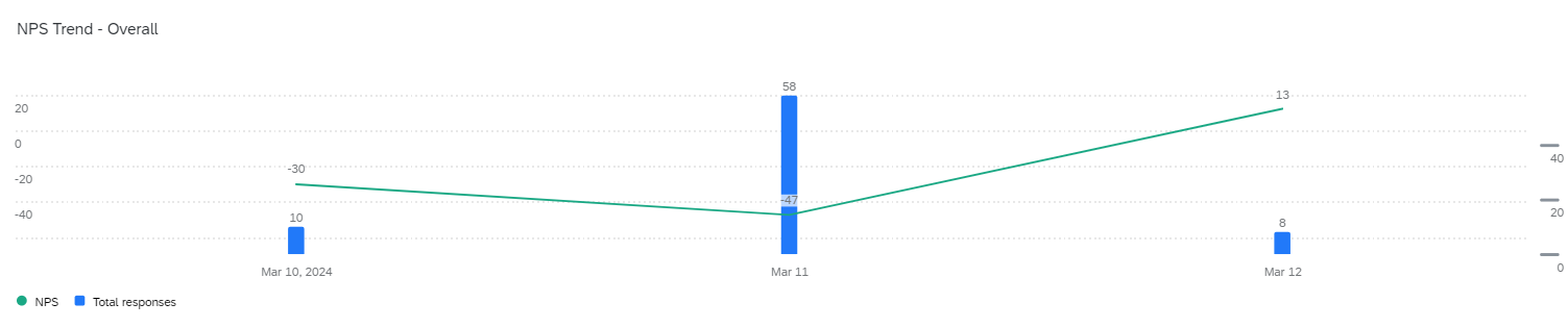
Once you set it up like this, your dashboard widget will resemble the screenshot below:
Let me know if this helps.
Already have an account? Login

Welcome! To join the Qualtrics Experience Community, log in with your existing Qualtrics credentials below.
Confirm your username, share a bit about yourself, then you're ready to explore and connect .
Free trial account? No problem. Log in with your trial credentials to join. No free trial account? No problem! Register here
Already a member? Hi and welcome back! We're glad you're here 🙂
You will see the Qualtrics login page briefly before being taken to the Experience Community.
Enter your E-mail address. We'll send you an e-mail with instructions to reset your password.

