how to change option button into images(thumbs-up) | XM Community
Skip to main content

Dear all,

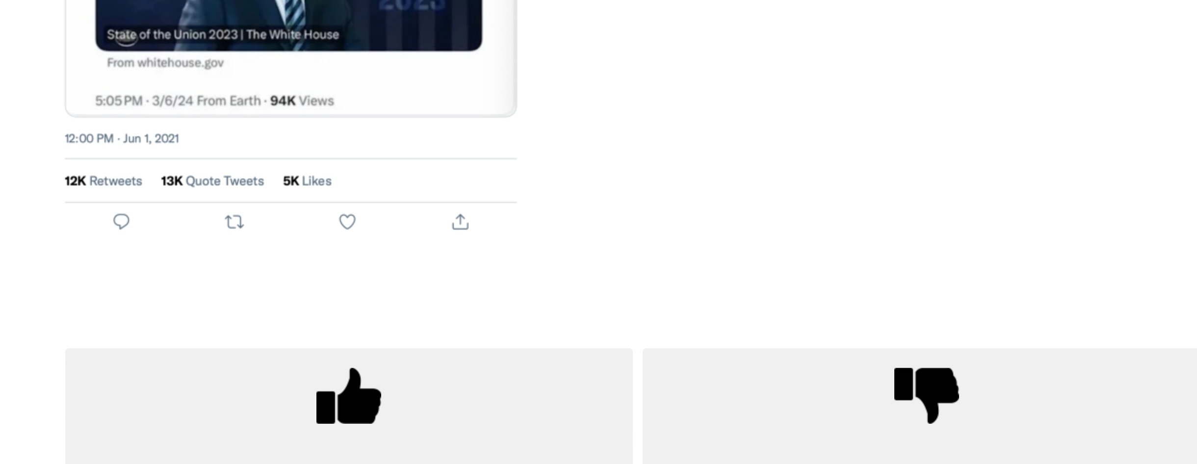
I would like to design a study that ask people to thumbs-up/down a message, so the logic of this is the same as multiple choices, but I just want to make the option button as an image- thumbs-up image. I will capture what I want to examine in the following: 

I'm wondering if anyone are good at this or can provide some suggestions? thanks so much!

you can replace the answer buttons with images. it wont give the exact feel of a custom thumps up button ibn the shape.


you can replace the answer buttons with images. it wont give the exact feel of a custom thumps up button ibn the shape.


thank you so much for your reply! that was what I initially think about, and then I found the icon is not the same and resembles the twitter features(likes), so I'm wondering whether some scripts may help on making this better. 


Hi @biyingwudanny , try using different icons available on google.

Something like - Icon 1 or Icon 2


@biyingwudanny there is a way of using fa-fa fonts from awesome fonts using css inside javascript. But its a log process to try it out and not sure whether it will work.


Hi @biyingwudanny , try using different icons available on google.

Something like - Icon 1 or Icon 2

thank you for your kind response, I tried some! and I realised the problem may not be the icon(I actually use the format of png in the picture) but the setting of the “option button”, the grey part behind the thumbs-up cannot be eliminated.


Hi @biyingwudanny try using Modern layout, this will eliminate the grey part. Change it from the survey ‘look & feel section’.


@biyingwudanny there is a way of using fa-fa fonts from awesome fonts using css inside javascript. But its a log process to try it out and not sure whether it will work.

thanks for recommendation! as I'm not that familiar with javascript in web, I did not successfully insert, not sure why. but the reference is useful

https://fontawesome.com/icons/thumbs-up?f=classic&s=solid


Hi @biyingwudanny try using Modern layout, this will eliminate the grey part. Change it from the survey ‘look & feel section’.

thank you! and the modern style becomes like this 🤔


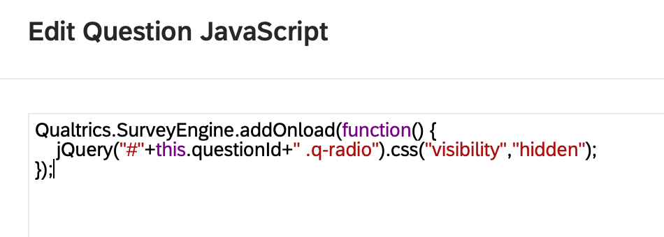
@biyingwudanny can you apply the below code in the question Javascript. It will hide the radio buttons/small squares.

Qualtrics.SurveyEngine.addOnload(function() {
    jQuery("#"+this.questionId+" .q-radio").css("visibility","hidden");
});


@biyingwudanny can you apply the below code in the question Javascript. It will hide the radio buttons/small squares.

Qualtrics.SurveyEngine.addOnload(function() {
    jQuery("#"+this.questionId+" .q-radio").css("visibility","hidden");
});

thank you! but for some reason it’s not working and nothing changes. may I wonder If others working?


@biyingwudanny which layout are you using?


@biyingwudanny which layout are you using?

still modern one?


@biyingwudanny yes with the Modern layout and the JS code, it worked for me.


@biyingwudanny yes with the Modern layout and the JS code, it worked for me.

o no! that’s weird! sorry for asking again, 

Or should I replace "+this.questionId+" as "+Q212+". my question ID is Q212


@biyingwudanny yes with the Modern layout and the JS code, it worked for me.

o no! that’s weird! sorry for asking again, 

Or should I replace "+this.questionId+" as "+Q212+". my question ID is Q212


thank you omkarkewat! to specify, the code is recognised by the system, but for some reason not reflecting in the radios. I'm wondering if I didn’t do something right?


Leave a Reply