Reduce space between question & answers and within answers | XM Community
Skip to main content

Dear All,

I have a multiple choice question where I include the question and the answers each as graphics. Now I am wondering how to reduce all the spaces as indicated in the picture below (it should look like a proper table).
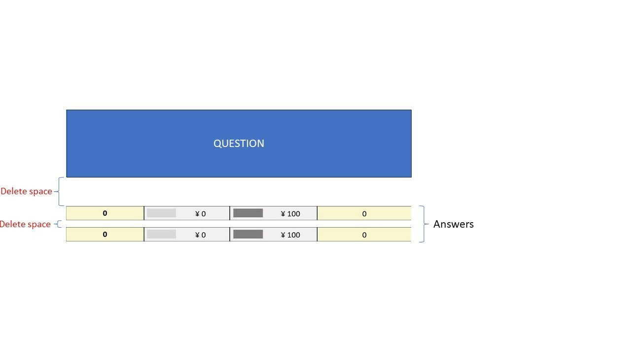
Current preview

My CSS code looks like this:

.Skin label.MultipleAnswer, .Skin label.SingleAnswer {
min-height: 0px;
margin-top: 0px;
padding: 0px;
}

.Skin label.MultipleAnswer.LabelPositionBELOW>span,
.Skin label.SingleAnswer.LabelPositionBELOW>span {
padding-bottom:0px;
}

.Skin .MAVR label.MultipleAnswer, .Skin .SAVR label.SingleAnswer {

background: #ffff;
}
.Skin label.MultipleAnswer.q-checked.q-focused,
.Skin label.SingleAnswer.q-checked.q-focused {
background: #ffff;
}


Thank you very much!!

The css will depend upon the question type, the theme and the layout being used.

You could start off by sharing a screenshot of the actual question where you want to reduce space. However, ideally, you should share a link to that particular question so that once could look at some JS or CSS in your theme impacting the spacing of the question/choices. 


Thank you @ahmedA !

The screenshot to the actual question you can find in my original question, which also indicates where I would like to reduce space.

I would also like to share a link to my particular question but I am not sure how to exactly do so. Can you give me brief instructions for that? The distribution/survey link (for participants) should not help here.


I attach the QSF file of my question, which can help us to find an answer more efficiently.


Thanks!


Here you go:

.Skin .QuestionText {
padding-bottom: 0;
}

.Skin .MC li .LabelWrapper {
margin-bottom: -10px;
}


You may need to tweak the negative value to get the desired look.

You can share your question/block:


@ahmedA, Thank you very much!


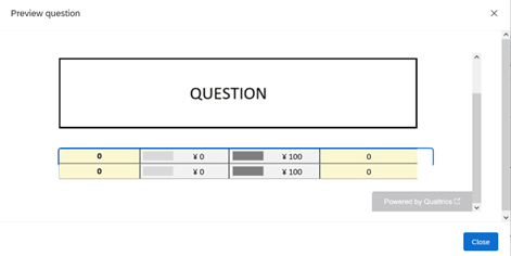
This gives me the desired look for the spacing between the answers:

Two questions remain:

  1. How can I reduce the space between the question and the first response option (first row in the table)?
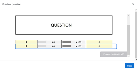
  2. Is there a way I can also reduce the blue selection box? Now it is larger than one option and thus not correctly shown as you can see here:


Leave a Reply