Hello,
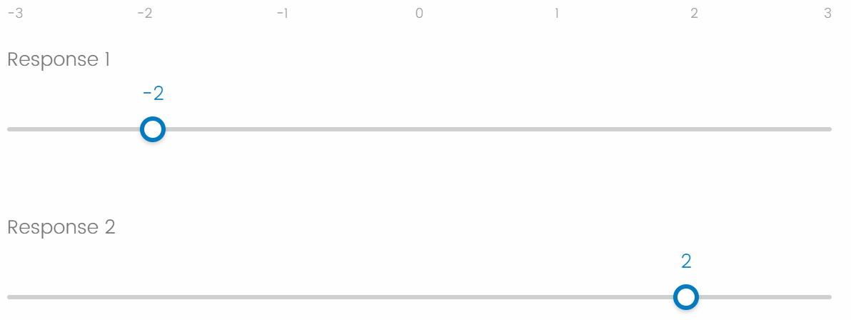
When I create a Qualtrics survey from scratch, insert a sliding scale item, select the "slider" format (not the "bar" format), and allow responses with 2 decimal places, the sliders are off-center relative to the scale points. For example, when the value of the slider is displayed as -2.00, the slider itself appears to be closer to -1.95. When the value of the slider is displayed as 2.00, the slider itself appears to be closer to 1.95. The value of the slider is more extreme than its apparent position in the scale, except when the slider is positioned exactly at 0.00, the center of the scale: My research requires that the value of the sliders correspond precisely to their position within the scale. I am wondering if this issue can be addressed, or if there is a known work-around for sliders with two decimal places.
Why this issue occurs:
I think this issue occurs because the range over which the slider can be dragged is slightly restricted at each end of the scale. When the user drags the slider all the way to the left, the user currently cannot place the center of the slider over the leftmost edge of the scale. Instead, the slider stops as soon as the outer edge of the slider reaches the leftmost edge of the scale. In contrast, when the user drags the slider all the way to the right, the user currently cannot place the center of the slider over the rightmost edge of the scale. Instead, the slider stops as soon as the outer edge of the slider reaches the rightmost edge of the scale. I think this range restriction creates slight discrepancies between the value of the slider and its apparent position on the scale, except at the very center of the scale.
If I am correct about why this issue occurs, then the solution should be straightforward. The slider should be allowed to span the entire range of this scale, and its values should be computed relative to this entire range. When the user drags the slider all the way to the left, the center of this slider should be allowed to be aligned with the leftmost edge of the scale, at which point the slider should take on the minimum value of the scale. When the user drags the slider all the way to the right, the center of the slider should be allowed to be aligned with the rightmost edge of the scale, at which point the slider should take on the maximum value of the scale. This will properly calibrate the visual position of the slider with the values that it displays, throughout the entire range of the scale.
When this issue occurs and when it does not occur:
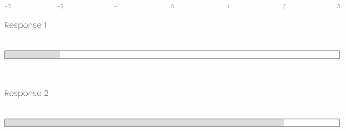
Within slider scale items, this issue occurs for the "slider" format but does not occur for the "bar" format. This is because bars already span the entire visual range of the scale. The issue is specific to the slider format, where the sliders currently are not allowed to span the entire range of the scale. Thanks very much for your help!
Sliders are off-center relative to the scale labels
 +3
+3Sign up
Already have an account? Login

Welcome! To join the Qualtrics Experience Community, log in with your existing Qualtrics credentials below.
Confirm your username, share a bit about yourself, Once your account has been approved by our admins then you're ready to explore and connect .
Free trial account? No problem. Log in with your trial credentials to join.
No free trial account? No problem! Register here
Already a member? Hi and welcome back! We're glad you're here 🙂
You will see the Qualtrics login page briefly before being taken to the Experience Community
Login with Qualtrics

Welcome! To join the Qualtrics Experience Community, log in with your existing Qualtrics credentials below.
Confirm your username, share a bit about yourself, Once your account has been approved by our admins then you're ready to explore and connect .
Free trial account? No problem. Log in with your trial credentials to join. No free trial account? No problem! Register here
Already a member? Hi and welcome back! We're glad you're here 🙂
You will see the Qualtrics login page briefly before being taken to the Experience Community
Login to the Community

Welcome! To join the Qualtrics Experience Community, log in with your existing Qualtrics credentials below.
Confirm your username, share a bit about yourself, Once your account has been approved by our admins then you're ready to explore and connect .
Free trial account? No problem. Log in with your trial credentials to join.
No free trial account? No problem! Register here
Already a member? Hi and welcome back! We're glad you're here 🙂
You will see the Qualtrics login page briefly before being taken to the Experience Community
Login with Qualtrics

Welcome! To join the Qualtrics Experience Community, log in with your existing Qualtrics credentials below.
Confirm your username, share a bit about yourself, Once your account has been approved by our admins then you're ready to explore and connect .
Free trial account? No problem. Log in with your trial credentials to join. No free trial account? No problem! Register here
Already a member? Hi and welcome back! We're glad you're here 🙂
You will see the Qualtrics login page briefly before being taken to the Experience Community
Enter your E-mail address. We'll send you an e-mail with instructions to reset your password.
