Hi All,
This is a question aimed for TomG but maybe someone else might be able to shine some light on it. (Isn’t it annoying that you can’t post images and excepts of code in private messages!)
I've run into an odd sizing problem with the Bipolar Matrix (when using one of TomG’s functions but I would like to think this is not causing the issue). The problem is that the matrix stretches on the second page of statements. This causes a problem in my new Theme (I’m moving from a static to dynamic theme) as it clips the statements and shows a horizontal scroll bar at the bottom.
Is there a way I can force the words of the statements to wrap around more and stick to the same width as the previous page so that I don’t get the clipping and scroll bar issue in the new dynamic theme?
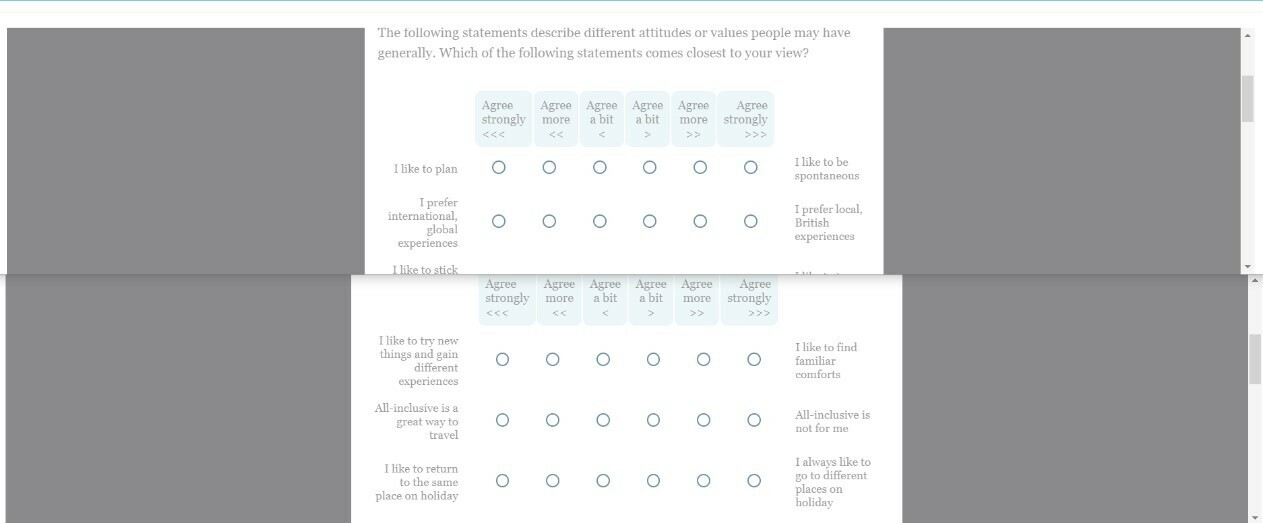
Pic1 - page 1 and 2 of the bipolar matrix survey - you can see the width is wider. I've checked the JavaScript and HTML within the questions and there is nothing I can see that would force the stretch.

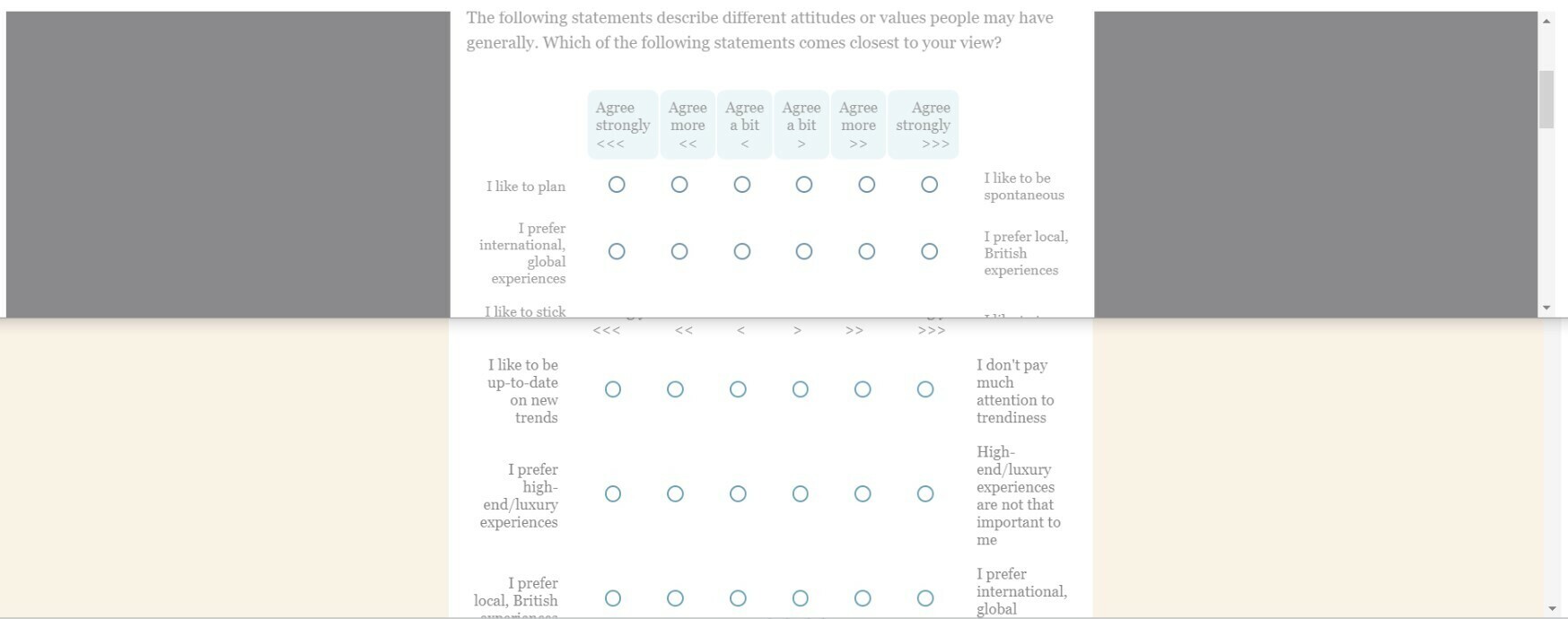
Pic 2 - this is page 1 of the bipolar matrix survey with the old static theme and the new dynamic theme I've created below. The widths are the same.

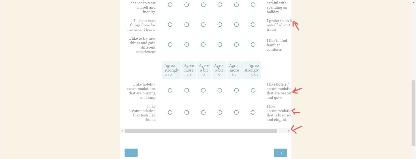
Pic 3 - this is the second page using the new dynamic theme where because the 2nd page is stretched, in the dynamic themed survey the statements are clipped. It would be nice to ensure the matrix question stays within the set page width and more wrapping of the words occurs.

note: My new dynamic theme uses the Classic mode with compact question spacing. I've reverse engineered and aligned as much as I can in terms of styles from what we had in the Static theme but I suspect there are some classes I have not yet managed to add into my css code and so this may well not be helping but the primary issue is that page 2 is wider / being stretched.
I’ll attach my css code here if necessary.
Thanks
Rod Pestell


