Hey Friends,
My team relies on data visualization/charts to constantly customize the visual impact of survey analysis results? This gets super time-consuming!
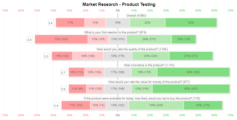
For our recent survey, we select the Likert chart from the data visualization tool (image attached). No doubt it's safe with a lot of time and resources.
Your suggestions required is this visualization fulfill the purpose to present the survey result or you will suggest some other visual or tools.
Thanks In Advance
Be the first to reply!
Leave a Reply
Enter your E-mail address. We'll send you an e-mail with instructions to reset your password.
