
There was a recent update on the Data & Analytics tab that made it less user friendly with a lot more white space between columns and requiring a lot more left and right scrolling in order to see all items. It was an annoying change but has just resulted in me doing more data exports rather than using browser interface.
And now there was recent change in the Email Distribution summary page. I've included a screenshot to show what I'm looking at.
Why do they insist having so much white space in the Total Sent to Spam columns? The Date/Time, Recipients, and Subject line can now only be fully seen by hovering over each label or opening up the distribution, and those are the more critical data points when trying to manage a survey with a bunch of mailings.
For clarification, I'm using 100% zoom in Firefox. I can see a bit more text if I zoom out, but then the font gets much smaller. Zooming out does not resolve the white space. I've confirmed this is also how it appears in Chrome.
Does anyone have any workarounds in dealing with this visual annoyances? 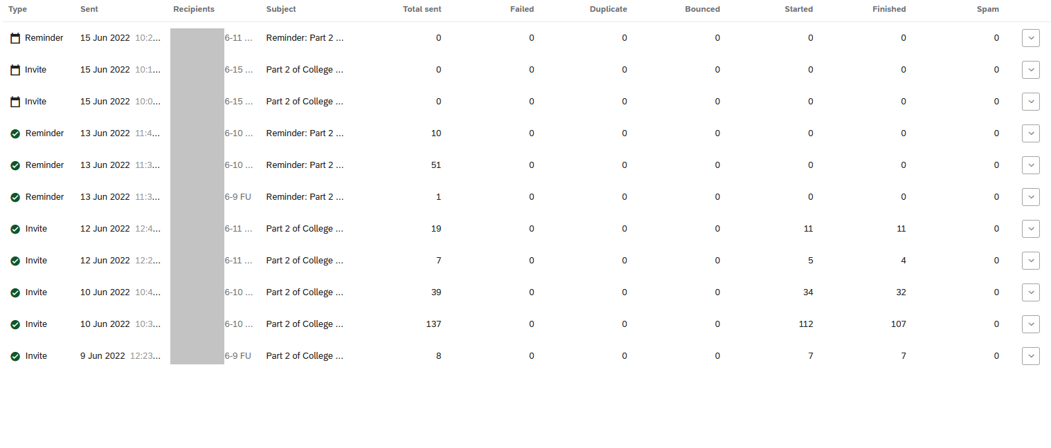

Why is spacing on various survey pages in Qualtrics so poorly optimized?

Sign up
Already have an account? Login

Welcome! To join the Qualtrics Experience Community, log in with your existing Qualtrics credentials below.
Confirm your username, share a bit about yourself, then you're ready to explore and connect .
Free trial account? No problem. Log in with your trial credentials to join.
No free trial account? No problem! Register here
Already a member? Hi and welcome back! We're glad you're here 🙂
You will see the Qualtrics login page briefly before being taken to the Experience Community.
Login with Qualtrics
Welcome! To join the Qualtrics Experience Community, log in with your existing Qualtrics credentials below.
Confirm your username, share a bit about yourself, then you're ready to explore and connect .
Free trial account? No problem. Log in with your trial credentials to join. No free trial account? No problem! Register here
Already a member? Hi and welcome back! We're glad you're here 🙂
You will see the Qualtrics login page briefly before being taken to the Experience Community.
Login to the Community
Welcome! To join the Qualtrics Experience Community, log in with your existing Qualtrics credentials below.
Confirm your username, share a bit about yourself, then you're ready to explore and connect .
Free trial account? No problem. Log in with your trial credentials to join.
No free trial account? No problem! Register here
Already a member? Hi and welcome back! We're glad you're here 🙂
You will see the Qualtrics login page briefly before being taken to the Experience Community.
Login with Qualtrics
Welcome! To join the Qualtrics Experience Community, log in with your existing Qualtrics credentials below.
Confirm your username, share a bit about yourself, then you're ready to explore and connect .
Free trial account? No problem. Log in with your trial credentials to join. No free trial account? No problem! Register here
Already a member? Hi and welcome back! We're glad you're here 🙂
You will see the Qualtrics login page briefly before being taken to the Experience Community.
Enter your E-mail address. We'll send you an e-mail with instructions to reset your password.