Multiple choice with don't know looks ugly | XM Community
Skip to main content
I'm trying to allow text entry with a "Don't know" option. (I have carefully considered the pros and cons on this, and want to include this option, thanks.)

Using multiple choice with some Javascript looks ugly, as you can see here: !

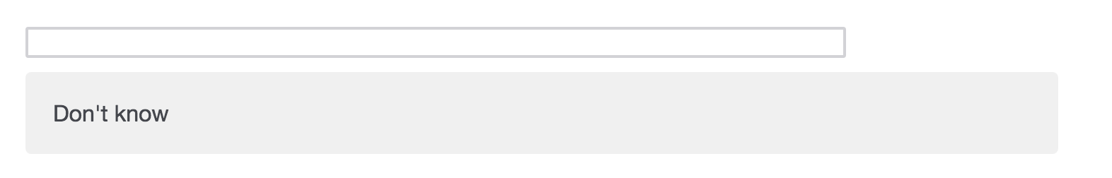
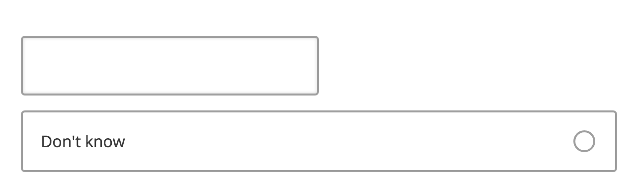
Is there a way to have a free text bar, and then a small radio button to click "Don't know", rather than that very large shaded "Don't know" block?
So if you have only two option a text box and the don't know, rather thank taking multiple select, take it as single select. Doing so don't know will appear as a radio button.
@bansalpeeyush29 this sounds promising but can you please explain what you mean by "single select"? I already have "single answer" checked, and I don't know what "single select" means: !


And here is the unattractive result I am getting:

!
you can try using different theme. Don't know appears large as of your theme.
With custom CSS you will have to reduce the width of "Don't know" box option
Hi @nate99 ,

You can refer below comment of @Mohammedali_Rajapakar_Ugam which is similar to your question


https://www.qualtrics.com/community/discussion/comment/6980#Comment_6980

Leave a Reply