Why does my 8 points likert scale (extra option: don't know) header not show fully? | XM Community
Skip to main content
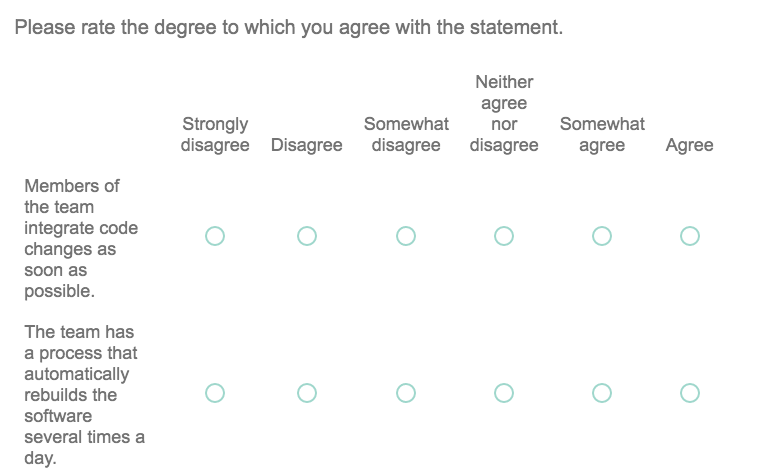
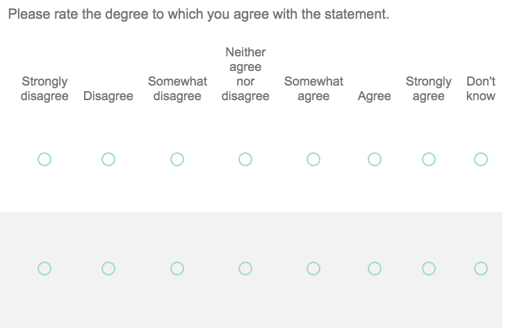
Right now respondents need to scroll to the right and they can't see the statements anymore. Please take a look at the pictures below. !

!


My respondents will answer on their computer, not on mobile. But how does my lay out become that they will see all the 8 points of the Likert scale simply next to each other? I used a matrix table for these questions.


Thank you very much in advance!


A student working on his Master Thesis in MBA: digital business.
If we have only matrix question on this page then try using below JS


`jQuery(".QuestionOuter").css("max-width",jQuery(".QuestionBody").get(0).scrollWidth+"px");`
Qualtrics calculates column width percentages based on the number of columns. However, if you have long words in the scale labels (also depending on font size), the columns will expand beyond their assigned percentage so the labels fit.


A couple of alternatives you could try:

1. Check the Position Text Above box (since your choice labels are long, this may be preferable anyway)

2. Allow some of the longer words in your scale labels to wrap by changing "Somewhat" to "Some­what" and "Disagree" to "Dis­agree"

Leave a Reply