Hi Qubies,
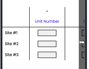
I am trying to write custom CSS on a side by side question such that both my first column and first row can be frozen panes. For example, I have 25 rows and 10 columns, with the first row containing answers and first column containing options. The high number of options necessitates scrolling both horizontally and vertically, especially while on mobile. In order to freeze panes I tried using the "position: webkit-sticky" functionality. It works successfully on the first column. However, it does not work well on the top row.
Here is the code I am using:
.QuestionBody { position: relative; }
.Headings th { position: -webkit-sticky; position: sticky; background-color: grey; top: 0px; }
.Answers th { position: -webkit-sticky; position: sticky; background-color: blue; top: 0px; }
.Choice th { position: -webkit-sticky; position: sticky; background-color: whitesmoke; left: 0px; }
The only one that works is the .Choice line.
I appreciate your help!
Thanks.
Hi Ananya,
I'm not able to get the first row to stick. Perhaps its how Qualtrics has configured the layout.
Meanwhile, you could do this. Use the code to make the first column sticky and add this JS to repeat your header after every 5 rows. Hope this helps:
Qualtrics.SurveyEngine.addOnReady(function () {
let header = this.questionContainer.querySelector("thead").outerHTML;
let all_rows = this.questionContainer.querySelectorAll("tr.Choice");
for (let i = 4; i < all_rows.length; i += 5) {
all_rows�i].insertAdjacentHTML("afterend", header);
}
});
Hope this helps.
https://community.qualtrics.com/XMcommunity/discussion/comment/38209#Comment_38209Hi Ahmed, any idea why the first row isn't sticking? I'm trying to figure this problem out myself. Thanks!
Hi
Thank you!
#QID1 > div.Inner.BorderColor.SBSMatrix > div > fieldset > fieldset > div > table {
display: block !important;
position: relative;
overflow-y: scroll !important;
height: 500px !important;
overflow-x: scroll !important;
width: 900px !important;
}

#QID1 > div.Inner.BorderColor.SBSMatrix > div > fieldset > fieldset > div > table > thead {
top: 0;
z-index: 3;
position: sticky;
background-color: white;
}

#QID1 .c1 {
left: 0;
z-index: 2;
position: sticky;
background-color: white;
}
Hi @Tom_1842! Thank you for your help! However, I am getting an error for the code. It says something around a part being illegal… I don’t know how to approach that because I don’t know any coding… Would you be able to help me?
Hi
Hmm it is working for side by side question on my end.. what browser are you using? Could you post a preview link to the survey or a qsf file so it might be investigated further?
By any chance you can tell me what should I do in order for the table to fit a mobile? There’s too much white space between each column and if I could remove that, it would’ve fit to mobile perfectly. Right now it looks like this. If I took off the white part it would work great:

Leave a Reply
Enter your E-mail address. We'll send you an e-mail with instructions to reset your password.
